How to make your WordPress site look better? 12 good practices
First impressions are critical in websites, as users decide within a few seconds whether a website is worth their time. Let’s explore 12 recommendations on how to make your WordPress site look better while improving readability, usability, and SEO metrics in the process.
7 pillars to a good-looking site
Have a clear brand identity
Having a clear and identifiable brand identity is easier said than done, as it combines several factors, like the appropriate use of logos, typographies, and colors. If you have no background in digital and web design, you may need the help of a professional for this, whether a freelancer who can give you some pointers or a digital marketing agency if you’re building a business website.
In general, some of the most important things to consider when trying to develop a clear brand identity include the following:
- Establish brand values and personality. Consider what your brand stands for and how you can visually convey those values to your customers.
- Be consistent. Once you’ve chosen a color palette, set of typographies, and overall imagery for your brand, stay consistent and use it across all branding materials.
- Study your target audience. Know what your target audience prefers and needs, then use that knowledge to inform your branding choices.
- Adapt your brand over time. Stay up-to-date on branding trends and incorporate the changes that suit your brand best.
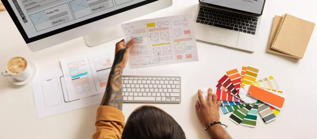
Use an editable theme
Don’t limit yourself to the default WordPress theme, which can be very minimalistic for the needs of many brands. Additionally, everyone familiar with WordPress can spot the default theme, making your site look amateurish.
Luckily, there are thousands of highly customizable free and premium WordPress themes. Editing your theme not only gives your site a unique look that stands out from all the default settings many sites use but also:
- Improves functionality if you decide to add new page templates, custom widgets, and more.
- Enhances the user experience by making your site easy to navigate.
- Improves search engine optimization.
Make your site easy to read and navigate
You’re creating a website so your users can benefit from it. One of your main priorities should be to make it as easy to read and navigate as possible. Consider the following when exploring ways to make your site more user-friendly:
- Keep menus short.
- Make interactive objects like buttons stand out from the background.
- Use a clear, sans-serif font like Arial and Helvetica in a readable size.
- Use white space and subheaders strategically to give content room to breathe.
- Place interactive and navigational elements where your users expect them to be. This is one aspect of website design where knowing your audience pays off.
- Customize the navigation bar to be straightforward and contain the information your visitors want.
- Make the sidebar stand out.
- Customize the footer to provide relevant information like contact information, blog posts your audience would find helpful, newsletter information, etc.
Focus on responsiveness

Your website should be responsive enough to display correctly on every device, or at least the devices and browsers your audience primarily uses. Responsive websites enhance the user experience, improve SEO and therefore reach, and lead to better conversion rates because they’re easier to use.
To develop a responsive website, consider the following:
- Use scalable vector graphics.
- Carefully consider and adapt button placement for all devices.
- Use different image sizes for different devices. For example, desktop sites may require 1200px per image, while mobile devices may require only 400px. Loading large images to all versions of your may lead to unnecessarily long load times.
- Add mobile-specific functions to your site’s mobile version. For example, you can encourage them to use your mobile app and link to the download or emphasize buttons to call customer service.
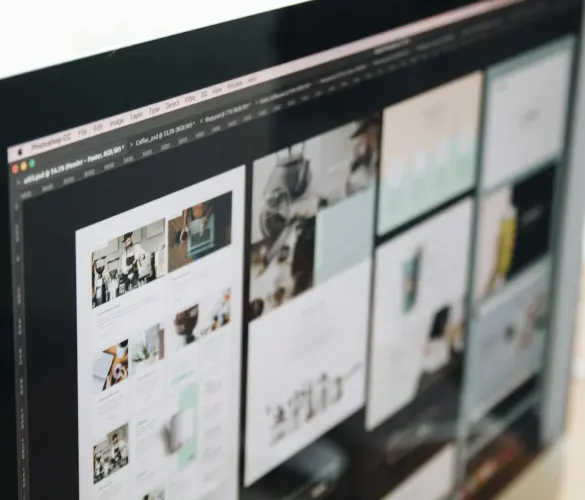
Use high-quality images
Users consider images a website’s most valued visual element, followed by colors, videos, and typographies. Because of this, high-quality and relevant images give your website personality and engagement while helping you convey complex concepts. However, you need to balance image quality with size.
Using compression tools to convert your images to a more manageable size while maintaining quality is highly recommended. Some plugins perform compression on the go, like Smush, but you can also use external compression tools like Tiny PNG.
Additionally, consider using a plugin like EWWW Image Optimizer to automatically convert images to the WebP format. WebP images tend to be smaller than other formats with mostly negligible loss of quality.
Create a custom homepage
This may seem obvious, but modify your homepage. The default homepage lists the latest posts to your website, which is not what you want. The homepage should be an introduction to your brands, content, and services, and you must create a positive first impression.
To create an effective custom homepage, consider adding the following:
- Clear and concise headlines and content that convey the purpose of your brand and website.
- An intuitive navigation menu.
- Social proof, such as customer testimonials, shows visitors your brand is trustworthy.
- Visual elements to engage visitors.
- Contact information and email opt-in.
Avoid common website design mistakes
There are many common website design mistakes to avoid, but some of the most significant include the following:
- Not modifying your templates. We already mentioned this, but it bears repeating that using the bare-bones templates from your theme makes your website and, by extension, your brand, forgettable.
- Low contrast. High color contrast allows users to differentiate between elements, like telling the text apart from the background or identifying interactive elements like buttons. Low contrast design worsens usability and readability.
- Hard-to-read fonts. It may be tempting to choose fonts because of their visual appeal and novelty, but hard-to-read fonts make your website harder to read and use.
- Bloated pages. Aim for every page to achieve one specific goal: contact information, newsletter sign-up, etc. The exception is your homepage, which should provide as much relevant information as necessary (without going overboard).
- Poor-quality images. Strike a balance between high-quality images and manageable size. Avoid any image that looks pixelated or is otherwise low-quality.
5 tips for a professional-looking website
Designing your website to look professional is essential for your brand’s image and credibility. Many elements go into creating a professional-looking website but consider incorporating these to improve your visitor’s experiences and first impression.
Use subheaders to break content

Breaking up your content into discrete sections using subheaders lets people who scan and skim through your site find the important content they want. It also makes your content seem focused and to the point.
Use white space strategically
Most people will not read most of your content, but it’s still essential to present it in a readable format. Using white space greatly improves readability and engagement by clearly separating the content from the rest of the page.
The exact white space-to-content ratio depends on the needs of your audience and brands. For example, Google’s front page and search results contain a considerable amount of white space. However, that much white space may not be ideal for other types of websites. Find the right balance for yours.
Simplify your layout
Simple layouts are good because they improve usability and readability while looking more straight-to-business and professional, being easier to remember, directing attention to the content, and transcending time-sensitive trends to become timeless.
Focus on a limited number of readable fonts
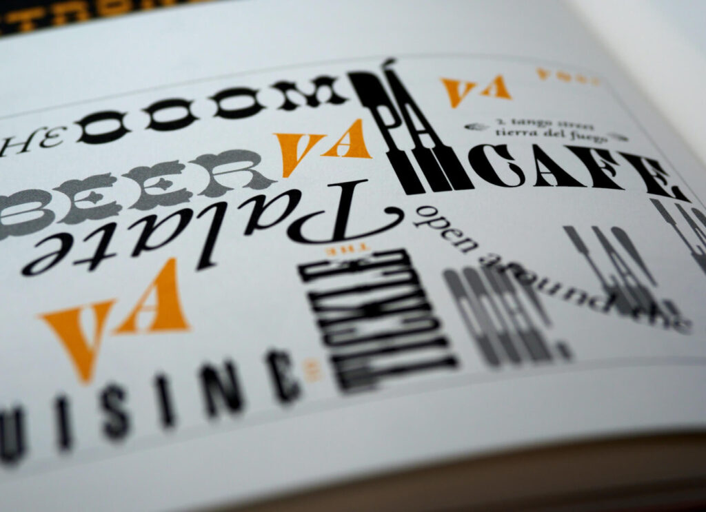
Using too many fonts or fonts that are hard to read hurts your website’s engagement because most are not going to want to sift through your text. They’ll simply leave.
However, there’s no need to use many fonts, either. Focusing on a select group of highly readable fonts attracts more readers and keeps them reading.
Disable comments on pages
Moderated comments on blog posts can foster a community, but there’s no need to keep comments on pages like “Contact Us.” By removing these comments, your website will look more focused.
There are many ways to improve your WordPress site’s look
As we’ve seen, there are many ways to make your WordPress site look better and more professionally developed. However, remember that these recommendations are just the tip of the iceberg. As you advance in your web development career, you’ll learn many other important skills.
Hopefully, these 12 tips will help you understand some of the fundamentals of professional-looking web design to improve your website’s usability, readability, and SEO metrics.
📬 Get WordPress updates to your inbox
Sign up for WC Blog updates and never miss a post!
Related Articles

How to Make a Subscriber Into an Admin on WordPress?

How to Grant Secure Access to a Not Live WordPress Site During Development

Do You Need a Web Developer to Build a WordPress Site?

How to Change the Bottom Padding Dimensions on WordPress Blocks