Website Color Theory: How to Choose Website Colors Correctly
Did you know colors have a huge impact on your website’s success? Find out how to choose the best color palettes for your website.

Choosing website colors is no less than an art form.
There are millions of colors to choose from when designing a website. And once you start combining them to form a palette? The array of choices becomes practically infinite. It can easily become overwhelming.
So, where to start? Whether you’re just beginning to set up your website or you’re thinking about giving it an upgrade, choosing color palettes shouldn’t be an arbitrary decision.
This ultimate guide to color theory for web design will help you understand how and why website colors matter.
Is color important for web design?
Colors define the design.
They give meaning without the need for words and guide the user’s movements around a product. Colors evoke emotions and call users to action. They’re also a great tool for brand recognition. Think about it, our brains remember colorful products much better than the ones that are restrained to black and white.
In web design, choosing color palettes can be overwhelming. There are so many options! Thankfully, colors follow certain rules and theories that can make these choices (a bit) easier.
Color Theory 101
Knowing the theory behind colors can help designers understand which colors work well together and why. It explains how colors relate to one another and how they make users feel. This guide will show you how to use colors to your advantage.
Color Wheel
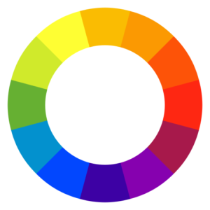
A basic color wheel consists of 12 standard colors; 3 primary, 3 secondary, and 6 tertiary ones.
The primary colors are red, blue, and yellow. Purple, orange, and green are the secondary colors, and everything else is a tertiary color – a mix of primary and secondary ones.
Using the color wheel correctly is a game-changer in design. Each slice of the pie represents a family of colors that can be achieved by mixing different saturations, hues, tints, and shades.
Plus, the wheel is the basis of the theory behind color schemes.
Color Schemes
Depending on how colors interact with one another, they can create contrast, cohesiveness, or impact. They can even evoke emotions.
This is what color schemes are about.
Every site has a color scheme: they’re the basis of a website’s identity. When properly arranged, colors will make any design attractive and effective to the users. Randomly chosen colors tend to feel chaotic and disorganized. Schemes, on the contrary, help products feel harmonious.
These are the color schemes that work well in design:
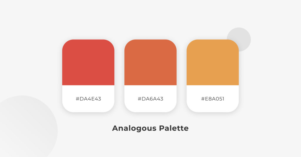
Analogous — this scheme uses colors located right next to each other on the color wheel. It creates a cohesive, unified feel – good for designs where no contrast is needed.
A common example is a red-orange-yellow scheme, which can create a feeling of warmth.
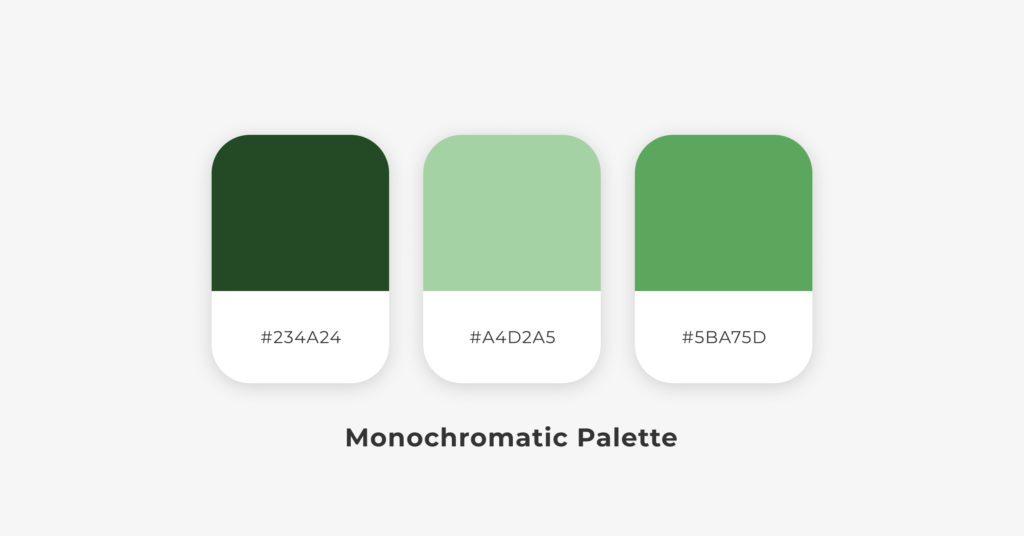
Monochromatic — a popular color scheme based on the various shades and tones of one color. Monochrome is always a winning choice: it’s hard to get it wrong!
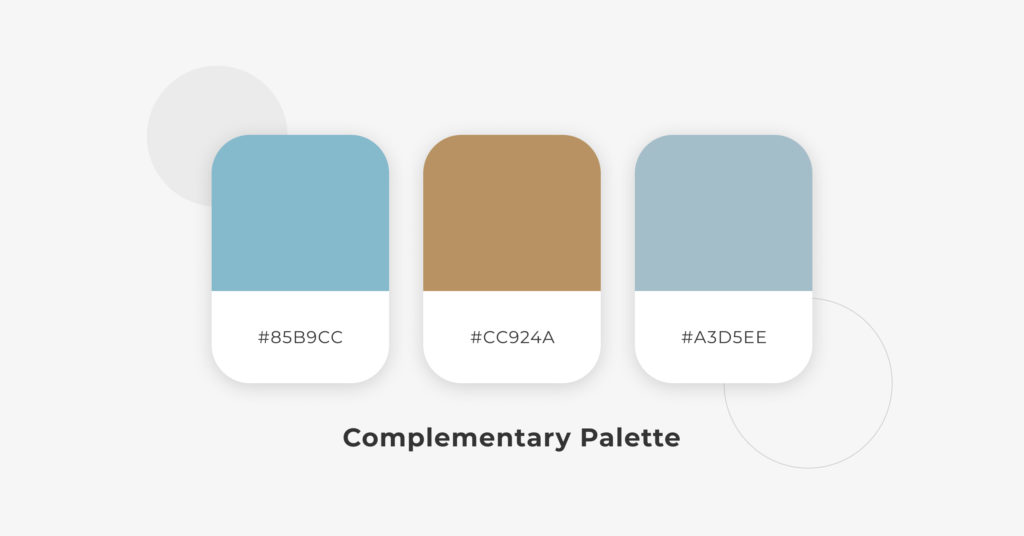
Complementary — it’s the combination of colors placed in front of each other on the color wheel. This scheme is opposite to the previous ones: its goal is to produce contrast.
Using complementary colors is great for call-to-actions: you won’t miss an orange button on a blue background.
Compound (or split complementary) — this scheme applies two complementary colors to the base one. It produces contrast, like the complementary scheme, while employing more colors.
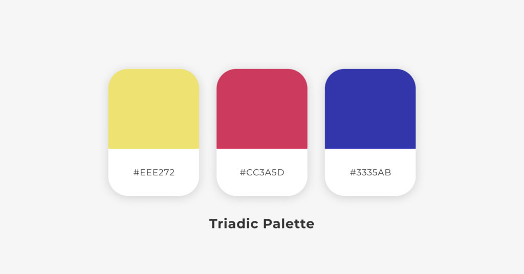
Triadic — made up of three colors that are equidistant on the color wheel. It’s easy to find: it selects three colors in the 12-step wheel that are located 120 degrees from each other, forming an equilateral triangle between them.
Usually, a color is chosen as a dominant and used for backgrounds, and the other two are the accents, used for content and navigation features. It’s a very reliable scheme that manages to be diverse and balanced at the same time.
Tetradic (or double complementary) — this color scheme selects 2 complementary pairs of colors from the wheel. Tetradic harmonies are difficult to pull off – they are hard to harmonize, yet stunning when done right.
Color Psychology
Each color evokes a certain mood.
Brighter colors like red or yellow have a very different vibrancy than darker shades such as blue or green. This vibrancy can evoke different emotions and moods; brighter colors feel warm, darker ones feel cold. Smart designs use these associations to your advantage.
Although some color associations are pretty universal, different cultures around the world may perceive colors differently. Please note that the emotional identifications described below are those of Western cultures.
Red — power, importance; it can mean danger and anger, or passion and love. Red attracts attention, which makes it perfect for warnings and important notices. Avoid it if a relaxed atmosphere is wanted.
Yellow — energy, joy, enthusiasm. Yellow universally represents the sun and summertime. While bright yellows are more energetic, darker yellows (such as gold) can feel timeless and wise.
Blue — calmness, safety, comfort. Blue is one of the most used colors. Its brighter shades are friendly and open, but its darker shades give a sense of reliability – which could explain why they are very common in corporate logos.
Green — growth, stability, freshness. Green has the relaxing qualities of blue while still retaining some of the energizing effects of yellow. It is the go-to color in environmental themes.
Black — boldness, edginess, sophistication, luxury. The feeling of elegance is especially strong when paired with white font and set against a minimalist layout.
White — cleanliness, virtue, simplicity, purity, sterility. White is very common in minimalistic designs.
Tools & Resources
Tools make a designer’s life easier. Here are some awesome tools that will help you further understand how color theory can be used for web design.
Coolors — generates random color palettes by the click of a button. Great when looking for inspiration.
ColorFavs — creates color palettes from images.
Color Safe — makes color palettes based on Web Content Accessibility Guidelines (WCAG) of text and background contrast ratios.
Paletton — fun, minimalistic tool.
We hope this knowledge helps you better understand how color theory shapes web design. Colors are powerful tools. They are never random, each one has different meanings and interpretations.
When thinking about your website, always remember to be deliberate and never use colors without purpose.
Next time you’re browsing online: pay attention! What color vibrancy was chosen and why? How does the color scheme impact the overall feel of the site?
📬 Get WordPress updates to your inbox
Sign up for WC Blog updates and never miss a post!