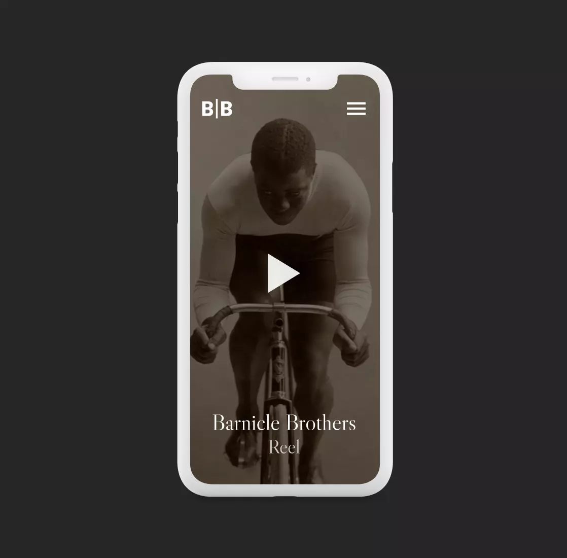
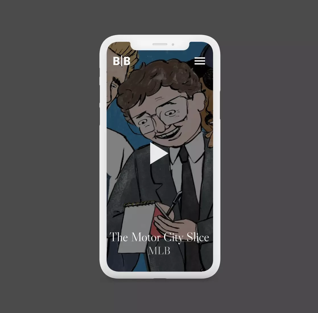
Emphasizing on audio visual content
The minimalism and visual hierarchies helped achieve the business’ goal: highlight multimedia content.
Visitors have no distractions, so the content takes all their attention.

A practical case study on the web design and development of the American content producer Barnicle Brothers. Find out how a filmmaker website is built.
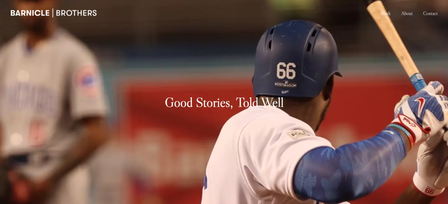

Barnicle Brothers is an Emmy award-winning company that produces original content for films, TV and digital platforms. Based in New York City, they specialize in sport and entertainment content, producing digital shorts, feature documentaries and branded content with one mantra in mind: Good Stories, Told Well.
They came to us with one need: a website that makes their content shine. They also wanted to meet the needs of potential consumers browsing their site. Users visiting their page would want to know what Barnicle Brothers is about.
And no better way to explain their work and identity than by displaying their videos.
As a content producer, Barnicle Brothers’ goal was to showcase their work. Content is the core of their business, so they wanted to make content the core of their website as well.
The minimalism and visual hierarchies helped achieve the business’ goal: highlight multimedia content.
Visitors have no distractions, so the content takes all their attention.
With a minimalist UI in mind, knowing how to work with visual hierarchy and harmony became fundamental. The Barnicle Brothers website has short, big headings with small blocks of text. Everything else is left for large visuals of films and images.

Humans naturally favor order over chaos. We also prefer apps and websites that have their UI elements organized and structured correctly.
That is why we included only the most basic navigation features. Few interface elements were used: almost no buttons, simple and well-known icons (for example, a letter or phone icon standing for forms of contact or a pin for location), and a black & white color palette.