
How to boost your WordPress site speed to 90+ on mobile

On every platform, website speed is essential to the user experience and to your site’s SEO score. Over the past decade, however, desktop browsing has been steadily replaced with mobile browsing, increasing the importance of fast mobile websites given how much of the user base now browse almost exclusively on smartphones and tablets. That means you as a developer have to prioritize learning ways to boost your WordPress site speed on mobile.
To answer several questions about the topic, especially for novice developers, this article explores the importance of mobile website speed, how to test your WordPress site’s speed on desktop and mobile, and how to boost speed for your entire site, emphasizing the mobile experience.
Why is it important to boost your WordPress site speed on mobile?
In the past ten years, mobile traffic has skyrocketed, making up the majority of modern internet browsing. As of the first quarter of 2023, 58% of the world’s internet traffic comes from mobile devices (excluding tablets), so your WordPress site has to be ready to accommodate them.
More specifically, these are the reasons why you should prioritize mobile speed:
- User experience. In the age of short-form content, mobile users tend to be impatient with slow websites. We want every site to load lighting-fast because we want to consume content in the least amount of time. Users may leave if your mobile site takes too long to load, increasing bounce rates and decreasing engagement.
- User retention. If you have an online business, user retention is critical, as it is cheaper to maintain a loyal customer base than to attract new customers. An inevitable result of slow load speeds is higher bounce rates, resulting in poor user retention over time. User retention is always great, but it’s especially crucial for online businesses.
- Catering to the specifics of mobile users. Mobile networks tend to be slower, less reliable, and have more latency than high-speed wired connections depending on the location, so making your website faster for mobile helps improve the user experience on inconsistent networks.
- Search engine optimization (SEO). Search engines incorporate multiple variables when ranking sites on search results, with speed being one of the most important. Moreover, Google prioritizes mobile speed when ranking search results. Since most organic traffic comes from Google, your WordPress site should be not only mobile-friendly but Google mobile-friendly.
- Sales and conversions. If you have an ecommerce site, mobile website speed is infinitely more important than for a personal blog, especially considering that over 90% of people use their smartphones to make online purchases. A slow mobile ecommerce site decreases your conversion rates and, potentially, your sales. For these businesses, mobile page speed is a matter of financial stability and growth.
How to test your WordPress site’s mobile speed?
There are many methods to test your website’s mobile speed. The one we use is Google’s PageSpeed Insights. All you need to do is paste your website’s URL, and you’ll get a score for performance (speed), usability, best practices, and SEO.
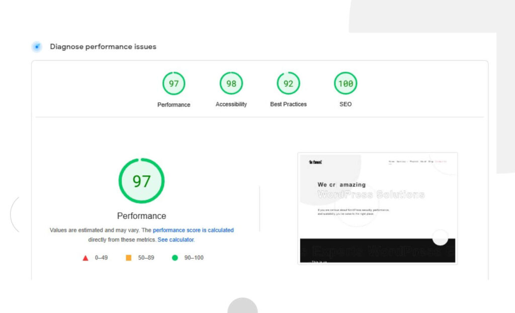
The results are separated into two tabs, desktop and mobile, so depending on how your site works, you may get two very different results. If you scroll down, you’ll find some recommendations for improvements, helping you inform the process moving forward.
By the way, don’t think your website is fast only because it doesn’t take long to load on your devices. If you frequently visit a website, your browser will cache data and have it ready for you the next time, significantly reducing load times. Users visiting your site for the first time have to load it from scratch, increasing the waiting time.
If the test returns a performance score below 90, consider applying PageSpeed Insights’ recommendations and trying the following methods to boost your WordPress site’s speed.
14 methods to boost your WordPress site’s speed on mobile
Update your WordPress and PHP version

To improve your WordPress site’s performance on all platforms, you should first update your core WordPress files and PHP version. Updates introduce security patches for known vulnerabilities and provide new features, stability, compatibility improvements, and, of course, performance enhancements.
The optimized code, bug fixes, and improvements to memory usage increase your website’s speed.
Use an optimized, responsive WordPress theme
Themes determine a WordPress website’s design, layout, and functionality by providing a template for how it’ll function with PHP, CSS, and JavaScript files. A theme’s optimization influences how efficiently it works and depends on multiple factors, including how lightweight and efficient the code is, whether it contains SEO-friendly markup, its compatibility with popular WordPress plugins, and other performance variables like image optimization, caching mechanisms, and more.
On the other hand, the theme must also be responsive, or it won’t rank as well on search engines. An unresponsive theme may still drive away users, even if it’s very fast.
Responsiveness depends on how the page adapts to optimize user experience across various devices, often emphasizing mobile. If you’re planning to code a theme from scratch, these are the six keys to a responsive WordPress theme you should keep in mind:
- Flexible grid systems. In the old days of the web, developers created websites with fixed, absolute pixel sizes. This may work fine for desktop but works terribly for mobile devices, where the elements look too small and can be tricky to use. Flexible grid systems allow website layouts to rearrange and resize proportionally to the device type and screen.
- Breakpoints. Breakpoints are thresholds at which the theme should switch the page’s layout. Most often, breakpoints are screen size limits established with CSS media queries. Web apps can detect the type of device and its size, so breakpoints serve to change the layout if the web app detects the screen size is above or below a specific screen size limit. Developers generally use at least three or four breakpoints to account for the most common screen sizes.
- Flexible images. Like grids, you can resize images to accommodate them proportionally to the screen and the rest of the page’s elements rather than assigning them a fixed size. Also, like grids, you enable flexible images with CSS styles.
- Responsive typography. You’re probably seeing a trend by now: responsive themes are all about web page elements that adjust their size to the user’s screen. Typography is no different, and CSS allows you to resize font sizes proportionally to the screen size and the rest of the page’s elements.
- Mobile-friendly navigation with hamburger menus. “Hamburger menus” are the three dashes you’ve probably already seen on countless mobile websites’ navigation bars. Hamburgers menus replace traditional desktop navigation bars, which can be too wide and contain too small text for mobile screens. Including them is a must for modern WordPress sites.
- Optimized buttons. On mobile, buttons must be proportionally larger than on desktop, given the inaccuracy and relative clumsiness of clicking with your fingertips instead of your mouse’s pointer. The average fingertip measures 44xp x 44xp, so your mobile buttons should equal or exceed 44xp x 44xp.
If you’re not quite ready to code a theme, the fastest alternative is licensing a high-quality premium theme, which costs around $40 to $100 for a permanent license. You can even share the license across all sites in your multisite network.
Finally, you can hire a WordPress agency to create a custom theme for your website. This is by far the most expensive option, but if you want your site to enjoy professional-grade performance and don’t have the time or skills to do it yourself, this is the option for you.
Use a fast WordPress web host
When choosing a high-performance web host, you should consider four primary factors: your site’s performance needs, web hosting plans, server locations, and server tech.
First, you need to determine just how resource-intensive your site will be. For that, you should explore factors such as the number of pages it’ll contain, how media-rich the content will be (videos, audio, animations, and other “heavy” media), whether it’ll need ecommerce functionality, how frequently the content will update, and how much visitor traffic you expect. These needs help determine your ideal web hosting plan for optimal speed.
Now it’s time to explore hosting plans and see which fits your needs best. The most common web hosting plans are shared hosting (affordable but low traffic limit), cloud hosting (scalable and flexible, suitable for inconsistent traffic), VPS hosting (a dedicated section of a shared server for better performance), dedicated hosting (great for large and complex sites), and managed WordPress hosting (hosting configured specially for hosting, making it high-performing but also more expensive).
Finally, server locations and technology influence site performance, too. Ideally, you’d choose servers that use solid-state drives (SSDs) and are close to the bulk of your target audience, minimizing distance delay.
Exploring all these factors and how they fit with your site may take time, but it’ll be worth it in terms of performance.
Use a caching plugin
WordPress page caching is storing a web page’s HTML and providing it directly to the users upon request rather than going through the process of dynamically generating it. Skipping the process of generating a web page improves your website’s performance, especially when many users request web pages simultaneously.
You can also cache objects like database queries and API responses to improve your site’s performance further. Combined with page caching, you can reduce your website’s load times to a fraction of what they used to be.
To get the performance benefits of caching, you could try some of the most popular caching plugins, such as WP Rocket, WP Super Cache, and W3 Total Cache. Additionally, some WordPress hosts like Bluehost and SiteGround provide WordPress caching.
Prevent hotlinking
Hotlinking, inline linking, or piggybacking is when a web page from one site embeds a resource (generally an image) from another location by directly linking to it. It means that instead of downloading the image and hosting it on their own server, the hotlinker displays a media resource on their site that is actually provided by an external server, consuming its bandwidth in the process.
If the embedded resource is part of a page with high traffic, the excess load on your server could affect performance to the point of crashing your site and potentially raising hosting costs.
The best way to prevent hotlinking is to add instructions to your server to serve images only to a specific group of domains. This group includes your website’s domain and search engines, so they can still drive organic traffic to your site through the image search feature.
On Nginx servers, add the following code, replacing “yourdomain” with your actual domain:
location ~ .(gif|png|jpeg|jpg|svg)$ {

     valid_referers none blocked ~.google. ~.bing. ~.yahoo. yourdomain.com *.yourdomain.com;

     if ($invalid_referer) {

        return 403;

    }

}
On Apache servers, add the following code, replacing “yourdomain” with your actual domain:
RewriteEngine on

RewriteCond %{HTTP_REFERER} !^$

RewriteCond %{HTTP_REFERER} !^http(s)?://(www\.)?yourdomain.com [NC]

RewriteCond %{HTTP_REFERER} !^http(s)?://(www\.)?google.com [NC]

RewriteCond %{HTTP_REFERER} !^http(s)?://(www\.)?bing.com [NC]

RewriteCond %{HTTP_REFERER} !^http(s)?://(www\.)?yahoo.com [NC]

RewriteRule \.(jpg|jpeg|png|gif|svg)$ - [F]
An alternative solution is installing a security plugin that includes hotlinking countermeasures. One popular plugin with this feature is All-In-One Security (AIOS) – Security and Firewall. Once installed and activated, go to WP Security > Firewall > Prevent Hotlinks to prevent image hotlinking. Then check the option “Check this if you want to prevent hotlinking to images on your site.”
Prevent brute force attacks
Successful brute force attacks may lead to malware infections that worsen performance and user experience with crashes and unresponsive behavior. Brute force attacks are a massive topic that needs its own article, but keep in mind the following security measures if you want to prevent them:
- Change your login URL to a unique, non-default location hackers should have no access to.
- Enforce two-factor authentication for login attempts.
- Enforce long, strong, and unique passwords for all accounts with admin access to your site.
- Limit failed login attempts with a plugin like Limit Login Attempts Reloaded or Wordfence Security.
- Use CAPTCHAs on the login page.
- Block logins from admins using known compromised passwords.
Optimize image size for mobile
Images engage your audience, but you must balance image quality with size. The best methods for optimizing image size while retaining quality are:
- Plugins that perform compression on the go, like Smush.
- External compression tools like Tiny PNG.
- Implementing the WebP image format. A plugin like EWWW Image Optimizer automatically converts images to the WebP format. WebP images tend to be smaller than other formats, with mostly negligible loss of quality.
Other than optimizing images, you should also keep an eye out for unused images hoarding space unnecessarily. Go to Media > Library from your admin dashboard to explore your media library and eliminate images from deleted posts or pages and otherwise unused images. Don’t be too liberal with this, though, as you may end up deleting images that some posts or pages currently use.
Get rid of render-blocking resources

Render-blocking resources are external CSS and JavaScript files that prevent a web page from rendering or displaying content until the external files load completely. Having unoptimized render-blocking resources bloats your page’s load time and worsens the user experience.
To minimize render-blocking resources, you must first identify critical and non-critical CSS and JS. To do that, go to Chrome DevTools’s Coverage tab. When the page loads, it’ll tell how much code was loaded and how much is actively in use. Click on a URL to inspect that file in the Sources panel.
Non-critical JavaScript and CSS code appears in red and critical code appears in green. Now that you’ve identified non-critical code, it’s time to reduce your page’s size and speed up load times.
JavaScript code
You’ll have to manually review your site’s JavaScript code to eliminate non-critical elements. During the process, consider the following:
- Move non-critical code from the render-blocking URL to an inline script tag in your HTML page. Once the page loads, the JavaScript code will have what it needs to control its functionality.
- Remove any inactive code.
- Look for third-party libraries you barely use and eliminate unnecessary code.
- Split the code into smaller packages with module bundlers like WebPack and Rollup.
- Minify your scripts manually or with the same module bundler tools.
- Optionally, look into WordPress plugins that automatically eliminate unused JavaScript code, like 10Web Booster.
CSS styles
- Load custom fonts locally rather than remotely.
- Manually minify your CSS stylesheets.
- Use plugins with minification features. Caching plugins like WP Rocket often have minification features.
- WordPress plugins that automatically eliminate unused JavaScript code also eliminate unused CSS selectors.
Reduce each page’s weight
Reducing your page’s weight or size means users have to load lighter resources, reducing the page load time. The primary methods to reduce a page’s weight or size are:
- Minifying your user-facing code.
- Implementing text compression (GZIP).
- Optimizing your images for performance.
Implement “lazy loading”
Lazy loading is loading only the images users can currently see on their screens. This is great for reducing bandwidth usage, increasing site speed, optimizing the Largest Contentful Paint score, and potentially decreasing hosting costs, but it may worsen user experience when quick-scrolling.
WordPress uses the browser’s lazy loading features to enable lazy loading by default. However, not all browsers use this feature, leading to inconsistent deployment. That’s why you should use a plugin to implement it.
Image optimization & Lazy Load by Optimole, Smush, and a3 Lazy Load are some of the most popular lazy loading plugins. In addition to lazy loading, they offer features like downgrading image quality when detecting slow networks, storing images in the cloud and serving them through a CDN, incorrect image size detection, and more.
Use a content delivery network (CDN)

A content delivery network (CDN) is a distributed server network strategically located in various locations. If your WordPress site is associated with a CDN, the network’s server stores its content (images, CSS and JavaScript files, etc.) in a distributed fashion, so users making requests get responses from the server closest to their location.
The physical vicinity reduces delay, speeding up load times. Your server will also work faster because the CDN is handling a significant amount of traffic.
Some of the most popular WordPress CDN providers include Cloudflare, BunnyCDN, QUIC.cloud, CloudFront, and Google Cloud CDN.
Reduce the time to first byte
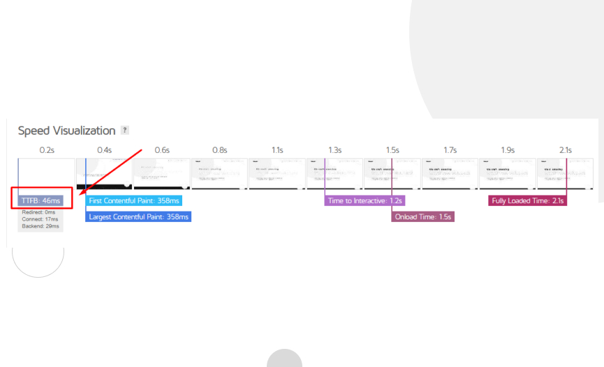
The time to first byte (TTFB) refers to the minimum time it takes for the first byte of information to reach the user’s web browser from the website’s server. A long TTFB gives the impression that your site is slow and worsens the user experience.
Ideally, your TTFB should be below 100 milliseconds, but anything below 500 milliseconds is good. Tools like GTMetrix estimate your site’s TTFB.
Improving your TTFB is a matter of implementing various solutions for website performance, such as:
- Using a fast hosting provider.
- Using a CDN.
- Installing a cache plugin.
- Keeping PHP, plugins, and themes updated.
- Cleaning up and optimizing your database.
- Deleting unused plugins and themes.
Display only excerpts of your pages and archives
By default, WordPress loads the entire content of every page or post featured on your homepage or archives. This can significantly slow down loading time and reduce traffic to the featured pages and posts since there’s no need to open them on a separate tab.
To display excerpts instead of the full content, go to Settings > Reading from your admin dashboard. Find the “For each article in a feed, show:” option and tick “Summary” instead of “Full Text.”
Break your comment sections into pages
Having engaged users who interact with your content is generally a great sign, but long comment sections also slow loading. The solution is breaking up your comment sections into pages so users don’t have to load potentially dozens of comments every time.
To do it, go to Settings > Discussion, find the “Break comments into pages” option and tick the checkbox next to it.
Improving your WordPress site’s mobile speed is crucial
Mobile speed is crucial for WordPress sites due to the massive increase in mobile traffic over the past decade. With mobile devices accounting for 58% of internet traffic, it’s essential to prioritize mobile speed to provide a positive user experience, improve user retention, cater to mobile network limitations, enhance search engine optimization (SEO), and boost sales and conversions for ecommerce sites.
Hopefully, the information in this article will help you understand the basics of website performance and guarantee a seamless and fast experience for your users.
Continue to read our blog if you want to dive deeper into WordPress guides, tips, and tricks!
📬 Get WordPress updates to your inbox
Sign up for WC Blog updates and never miss a post!
Related Articles

How to Grant Secure Access to a Not Live WordPress Site During Development
How to Add Text Borders in WordPress (2 Methods)

How to Change the Bottom Padding Dimensions on WordPress Blocks

How to Disable the “Similar Posts” Section in WordPress Blogs