
How to Convert a Container-Based Layout to a Column-Based Layout in WordPress

Columns and containers are some of WordPress’s most popular layout styles. Depending on the project’s specifications and your personal preferences as a designer or developer, you may need to convert a WordPress container layout to a column layout.
To do that, you can use Gutenberg’s built-in Column block or modify the settings for page builders like Elementor.
Let’s get into how to convert your container-based layout into a column-based layout in WordPress.
Key Takeaways
- Containers and columns are 2 popular layout styles WordPress designers and developers use to organize content.
- You can convert a container-based layout into a column based layout with the Gutenberg editor or by changing Elementor’s settings.
Containers vs Columns: What’s the Difference?
What Are Containers in WordPress Themes and Layouts?
In WordPress themes, a container is a layout style that organizes content inside a bounding box. This bounding box typically spans the page’s width by default.
One notable application of the container layout is Elementor’s Flexbox Container, an alternative to the section and column layouts developers have traditionally used with the <div> and <section> HTML elements. You can edit the Flexbox Container by modifying traits like width, height, content, and alignment. Flexbox Containers can also contain other Flexbox Containers within them, giving you significant control over the page’s layout.
The Gutenberg editor also displays blocks as fixed-width containers by default, covering the entire width of the post or page.
What Are Columns in WordPress Themes and Layouts?
Columns are a layout style used to organize content vertically rather than horizontally like in containers. Columns are great for breaking up text and arranging content side-by-side .
Developers and designers can structure their site’s content in columns by using the Gutenberg editor or a site builder like Elementor, Divi, or Beaver Builder.
Important: Back Up Your Site Before Moving Forward
Backups give you a checkpoint you can return to if anything goes wrong, allowing you to reverse unintended consequences and try again. This allows you to go back to a previous stage on your site’s development if you don’t like the results of converting containers to columns.
There are several methods to create backups, but using plugins is one of the easiest. Our team has used the backup plugin UpdraftPlus, and it’s very reliable. Read our backup guide for a step-by-step on how to back up your WordPress site.
How to Convert a Container Layout into A Column Layout in WordPress?
Now that we understand the difference between these layout styles, let’s explore some methods for implementing columns in your WordPress site.
You can convert containers to columns in various ways, but in this guide, we’ll focus on the Gutenberg editor and Elementor. Gutenberg is the default page and post editor, and Elementor is one the most popular free page builders, making them both accessible to all WordPress users.
Here’s a step-by-step guide on how to convert containers to columns in WordPress.
Method #1: Using Gutenberg
Gutenberg has a built-in method for displaying content as columns through the Column block.
By default, WordPress displays blocks as containers that span the page or post’s width, such as when you insert an image and a paragraph one after another.
If you want to display images and text as vertically separated blocks of content, you can use the Column block.
First, create a new post/page or edit an existing post/page by going to Posts or Pages from the admin dashboard. Then click Add new post or Add new page, or click Edit on an existing post or page.
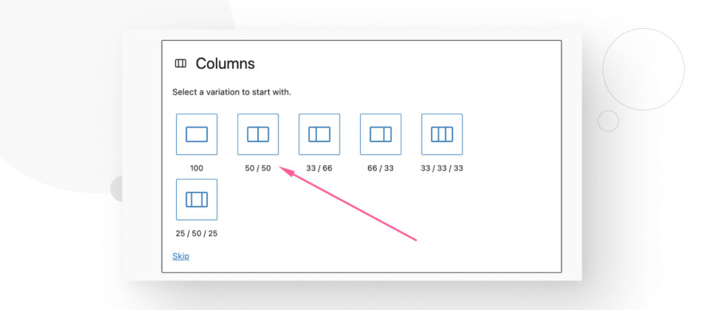
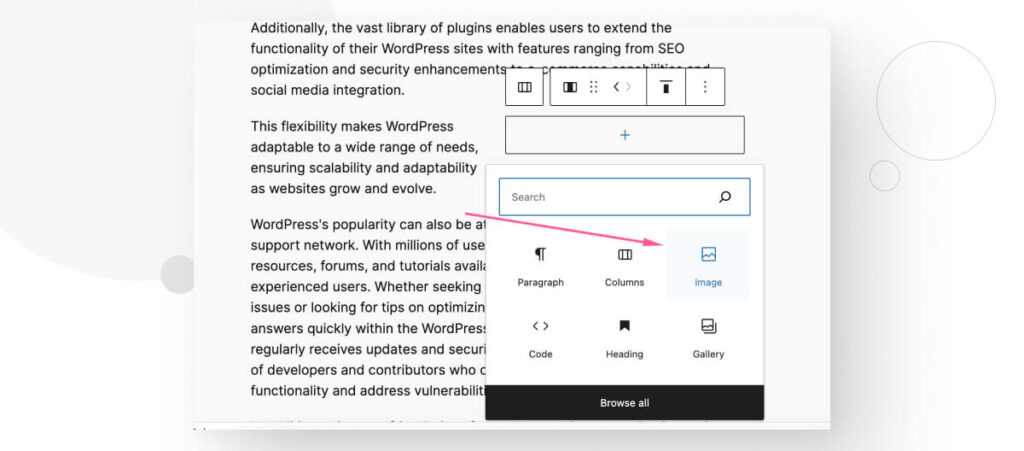
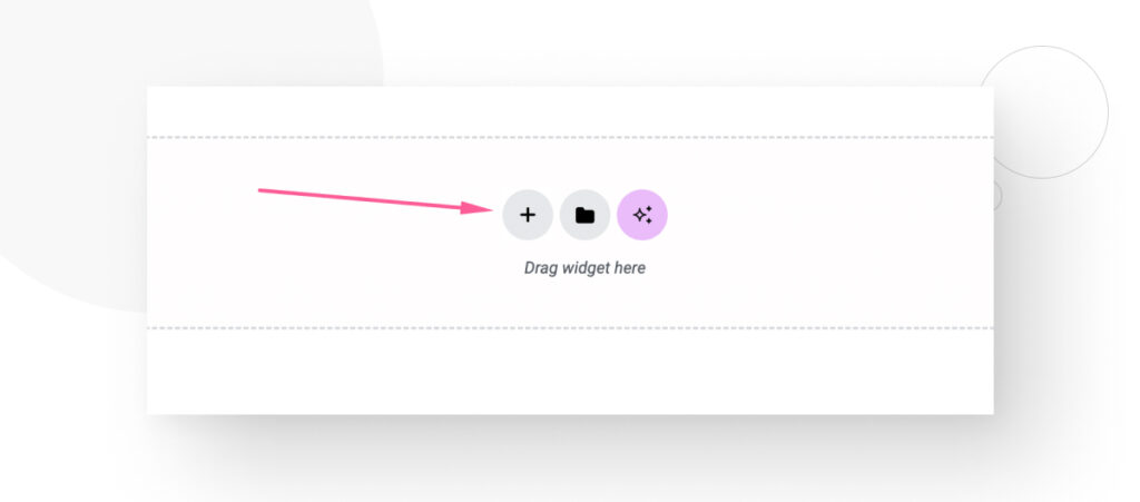
Once in the post or page, click the + button to insert a new block and search for “columns.”
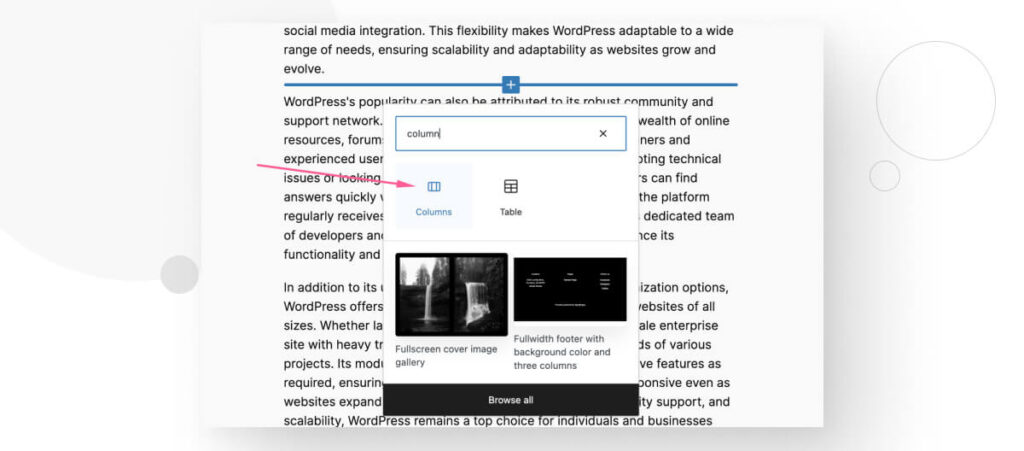
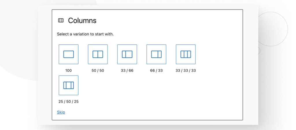
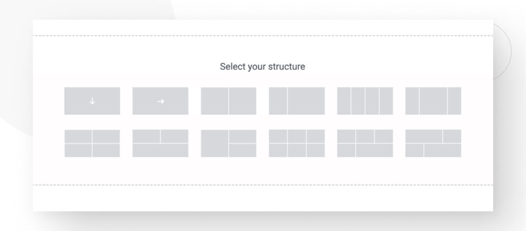
The new block will provide various distribution options. Let’s first use the 50/50 option to create two columns of equal width.
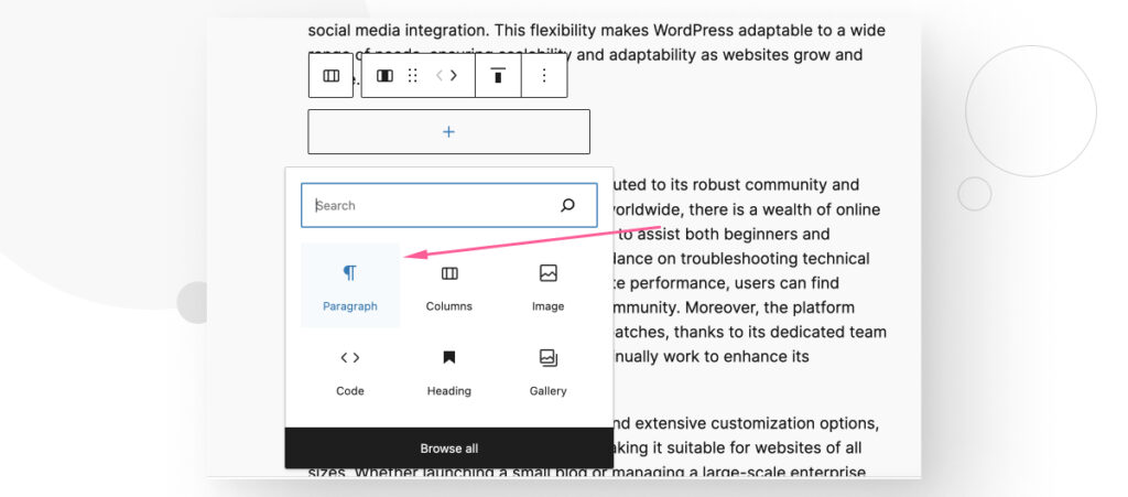
Now, you can display a paragraph and an image side-by-side. Start by adding a new Paragraph block.
On the new paragraph block, type or paste the text.
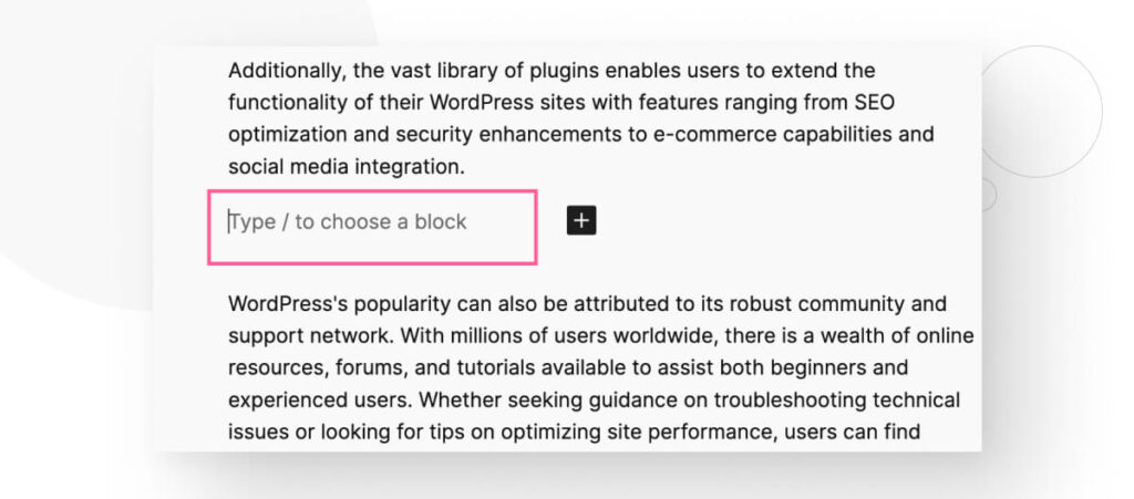
As you write, you will notice the text stays within the Paragraph column you just created.
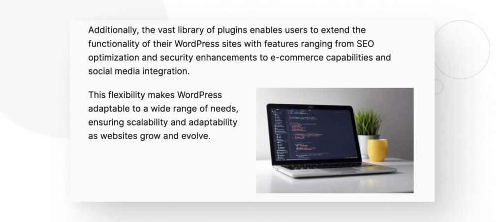
Now, let’s add the Image block to the side.
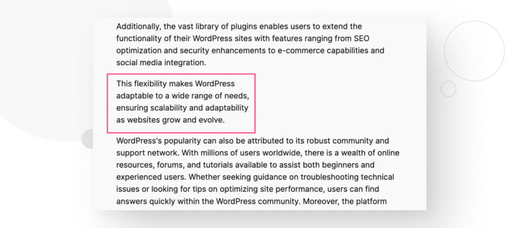
After adding the image, it’ll also stay within its corresponding column instead of covering the width of the page or post.
You can repeat the process to add multiple columns of varying widths.
Method #2: Using Elementor
If you’re using Elementor instead of Gutenberg to build your pages and posts, you can also convert container-based layouts into column-based layouts by changing the plugin’s settings.
For example, here’s a test page created with Elementor. It has text, buttons, and an image.
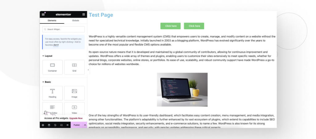
By default, Elementor is using the Flexbox Container feature we mentioned earlier. If you click the Add New Container button, you will see multiple container structures to choose from.
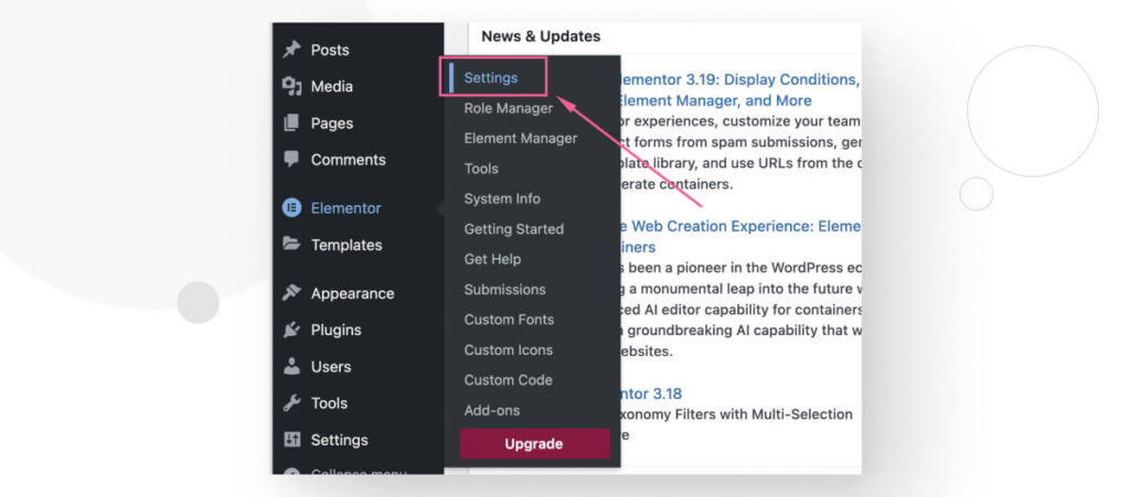
We want to change this feature to display multiple column structures instead. To do that, go to the WordPress dashboard and click on Elementor > Settings.
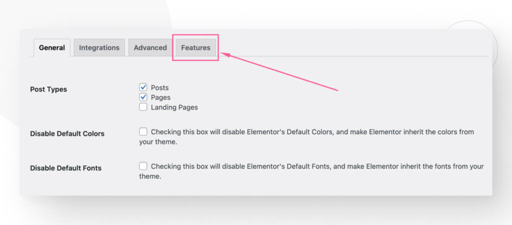
Go to the Features tab.
Once in the Features screen, scroll down until you see the Flexbox Container section. Click on the dropdown menu and select Inactive.
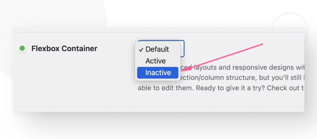
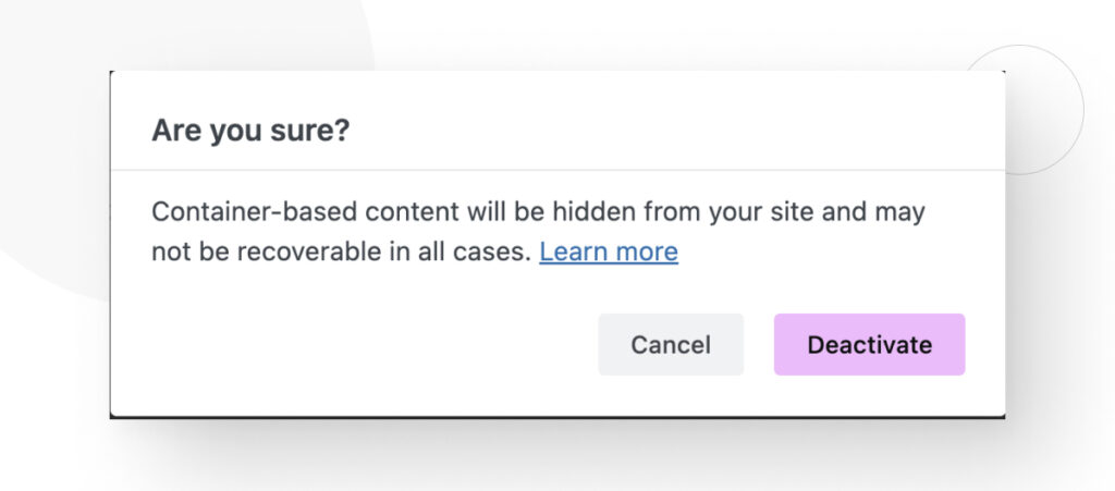
Click Deactivate on the pop-up message. This will deactivate the Flexbox Container feature and go back to the traditional sections and columns.
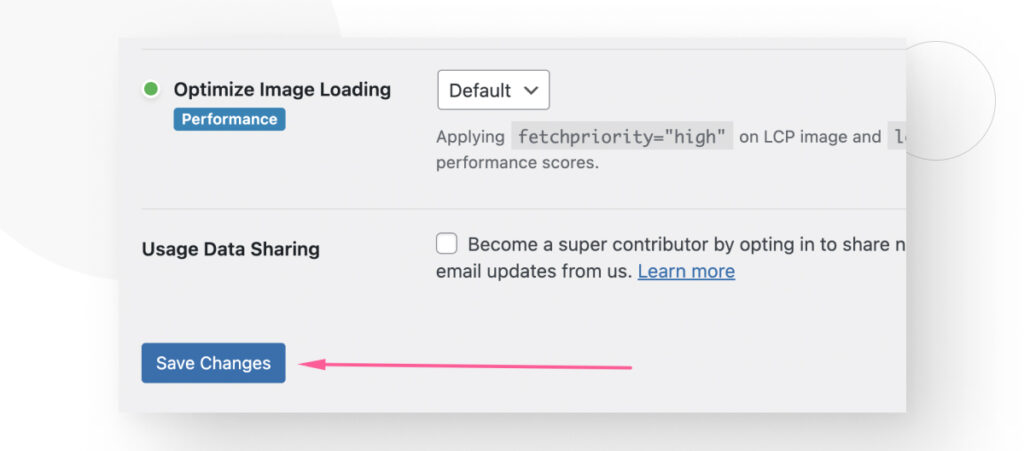
Scroll down to the bottom of the page and click on Save Changes.
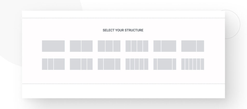
Finally, return to the page you were editing and click the Add New Section button.
You will have multiple column structures to choose from.
Now You Know How to Convert a Container Layout to a Column Layout in WordPress
Depending on your project’s specifications or preferences, you may prefer using a section and column layout rather than a container-based one.
In this article, we explained 2 methods for converting a container layout to a column layout in WordPress. Hopefully, you can use this new knowledge to change the layout style and gain more control over your site’s design.
If you found this post useful, read our blog for more WordPress insights and guides!
📬 Get WordPress updates to your inbox
Sign up for WC Blog updates and never miss a post!
Related Articles

How to Make a Subscriber Into an Admin on WordPress?

How to Grant Secure Access to a Not Live WordPress Site During Development

Do You Need a Web Developer to Build a WordPress Site?

How to Change the Bottom Padding Dimensions on WordPress Blocks