
Top 4 Best Browsers for WordPress 2024

Whether you’re a beginner or an expert WordPress user, choosing the right browser to develop your site is important.
The browser you use determines performance, security and data privacy, the extensions you can access, and more, so choosing the best browser for your WordPress development needs will influence your project’s workflow.
Let’s review the best browsers for WordPress, its features and development tools, and how to determine which suits you.
Key takeaways
- Multiple browsers provide the tools WordPress developers need, including Chrome, Safari, Edge, and Firefox.
- Choosing a browser to develop depends on its performance, security features, reliability, developer tools, and extension support.
- Regardless of the browser you develop your site on, you should always test your site on all major browsers to ensure compatibility with the largest possible percentage of users.
Factors to Consider When Choosing the Best Browser for WordPress
When choosing a web browser to develop your WordPress site, it’s important to consider several key factors that can impact your development flow and the final user experience. Here are the main factors to consider:
- Security features. You need a browser that protects you against security threats, especially when accessing personal and sensitive information. Choose a browser with robust security features and a track record of addressing security issues promptly.
- Sync capabilities. A browser with sync capabilities can significantly enhance your workflow by allowing you to access your bookmarks, passwords, and other data across multiple devices. This feature is particularly useful for developers who work on different platforms or switch between devices.
- Reliability. Reliability includes not only the stability of the browser itself but also the availability of support services to address any issues.
- Speed. A fast browser can improve development efficiency by loading pages and executing scripts quickly. Since web development involves testing and tweaking websites in real time, a slow browser can hinder your productivity.
- Dev tools. The browser should offer various developer tools (such as consoles, debugging tools, CSS viewers and editors, etc.) to facilitate development tasks.
- Extensions. Browsers with plenty of extensions for developers and QA analysts can make your job easier. Extensions provide ready-to-use software solutions for inspecting and editing elements, clearing the cache quickly, and other processes that would otherwise take longer.
- Popularity. Regardless of your browser preference, you should always test your site on the most popular browsers to ensure the user experience is good across platforms.
Top Browsers for WordPress Users and Developers
#1 Google Chrome
Chrome is the world’s most popular web browser, with a 65% market share in 2023. Developed by Google, it was first released in 2008 for Microsoft Windows. Later, it would run on macOS, Linux, iOS, and Android.
Chrome provides fast performance, a clean and straightforward interface, and robust security features. It also supports extensions, add-on software that can enhance or extend Chrome’s functions, much like WordPress plugins.
Google Chrome is the web browser our developers use the most since it’s the most popular. As a result, ensuring compatibility with Chrome means optimizing the user experience for the largest number of users. That said, we still test and perform quality assurance on all other major browsers.
Google Chrome Features for WordPress Developers
Chrome has hundreds of developer tools you can use to test and debug your WordPress site. These are some of the ones you can start looking into when exploring their web dev features.
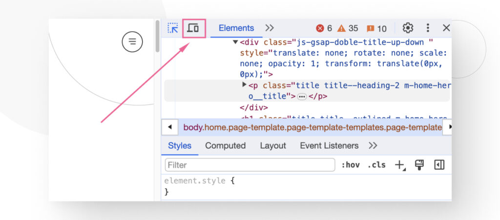
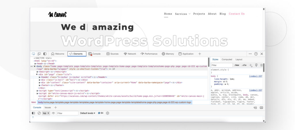
Elements Panel
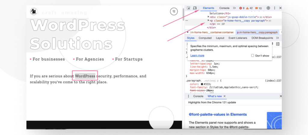
The Elements panel allows developers to interact with the HTML and CSS of a webpage in real time. More specifically, the Elements panel presents a live view of the web page’s Document Object Model (DOM).
You can hover over elements in the DOM tree to highlight them on the page, select any element to view its HTML, and edit tags, attributes, and text content directly in the panel. This is very useful for debugging layout issues and testing changes.
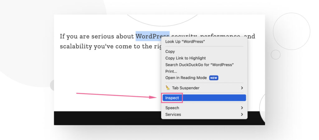
To access the Elements, you need to highlight an element and use the CTRL + Shift + I or CMD + Option + I shortcut or right-click and select Inspect.
The Elements panel will open up, letting you explore and modify text, CSS rules, and much more.
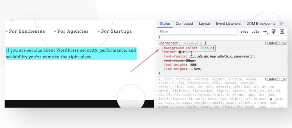
For example, you can create a new CSS rule like we did here, adding background-color: aqua to a paragraph.
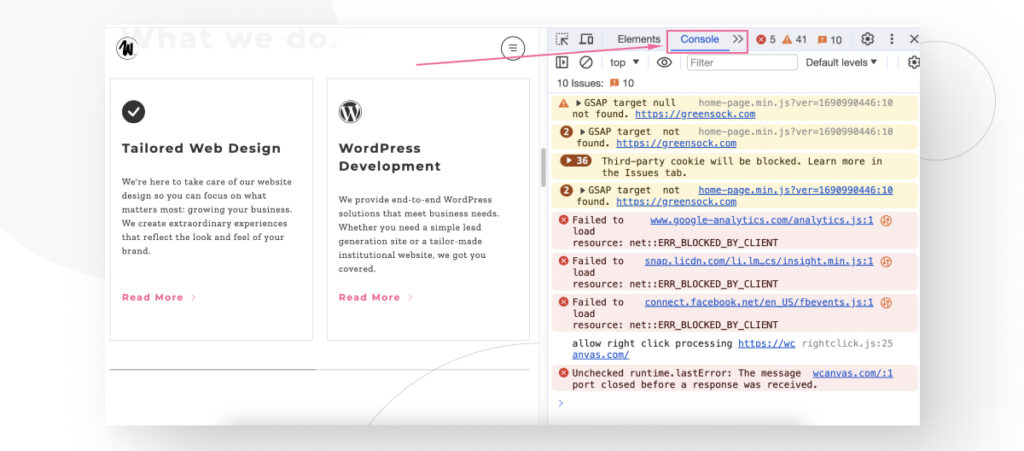
Console
The console provides an interface for logging information, running JavaScript commands, and interacting with the DOM.
One of the most useful features of the console is viewing logged messages to ensure code is executing as expected and inspecting the values of variables at specific times.
To open the console, press F12.
Simulate Mobile Device Viewports
Responsive design is essential for the user experience and SEO performance. For that reason, Chrome allows you to check how your site looks at different screen sizes, helping you optimize your theme for all devices.
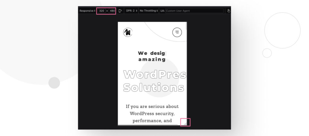
Open the dev tools with CTRL + Shift + I or CMD + Option + I and click the Toggle Device Toolbar button.
Now, you can modify the viewport size by manually inputting the resolution on the upper toolbar or dragging the controls around the viewport. This helps you simulate your site’s appearance on different devices, including tablets and smartphones.
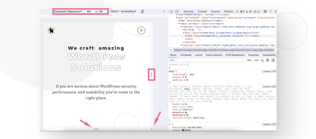
Keep in mind that while you can simulate the viewport, you can’t fully simulate performance because mobile and desktop CPUs work differently. It’s always better to test the mobile experience on an actual mobile device, but Chrome’s simulation provides a good approximation of the visual aspects of web development.
Google Chrome Extensions for WordPress Development and Quality Assurance
In addition to hundreds of dev tools, Chrome has hundreds of extensions that make your web development and QA job easier. These are some of the extensions you may want to consider when developing in Chrome.
- CSS Peeper. A CSS viewer can easily measure the distance between elements and much more.
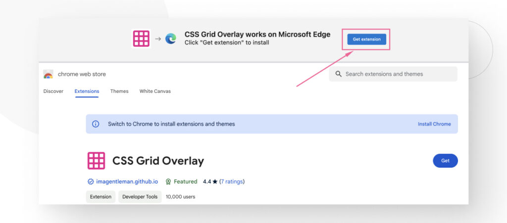
- CSS Grid Overlay. Confirm elements are aligned with the design grid.
- PerfectPixel. We use it to overlay the design on top of the website to spot differences.
- VisBug. Easily inspect styles and code.
- ColorZilla. A color picker tool to quickly identify the hex code for any element in the web page.
- Window Resizer. A tool to make resizing the viewport even easier.
- Clear Cache. Quickly clear the browser cache.
There are many more extensions, but these should give you some useful tools for developing your WordPress site.
#2 Safari
Safari is a web browser developed by Apple and integrated into its operating systems: macOS, iOS, iPadOS, and visionOS. It uses the WebKit browser engine, which is open-source and derived from the now-discontinued KHTML browser. Safari is designed to emphasize privacy, performance, and energy efficiency.
Apple’s flagship browser is also the second most popular browser in the world, with a market share of around 20%. Like in Chrome’s case, focusing your efforts on the browsers that more people use ensures compatibility with a greater portion of your target audience.
Safari Features for WordPress Developers
Like many other browsers, Safari has a suite of web development tools you can use to debug, test, inspect, and optimize content for peak performance and compatibility across Apple platforms.
Safari’s main dev tool is the Web Inspector, a command center for web development. Like Chrome’s web tools, it includes the Elements, Sources, and Network panels, along with several other panels, a console, and much more.
Here’s how to take advantage of a few of the basic features.
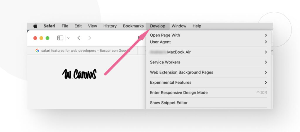
Enabling Web Developer Tools
To enable web dev tools in Safari, you need to go to Safari > Preferences from the menu bar.
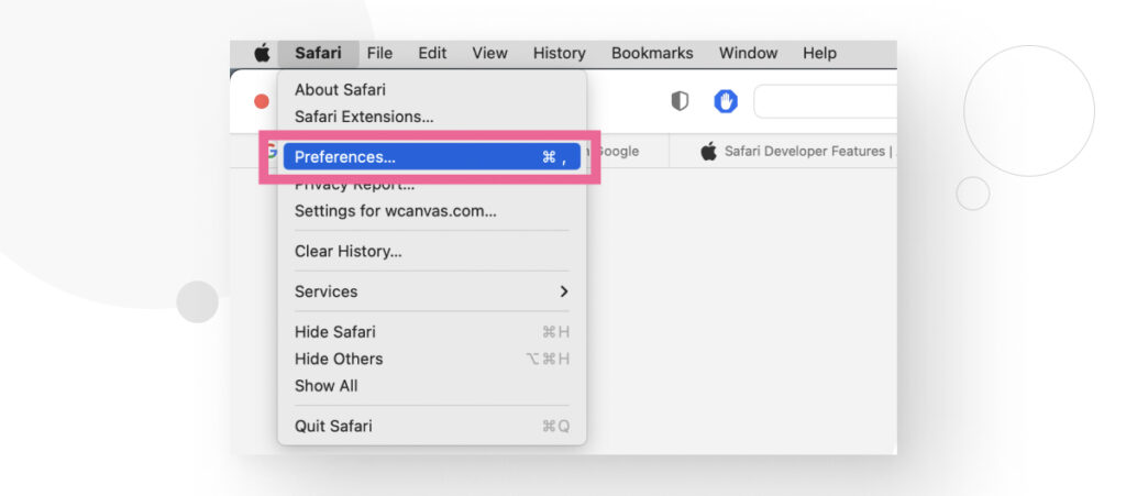
Go to the Advanced tab and check Show Develop in menu bar.
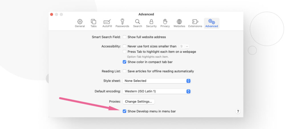
Now, the Develop dropdown is available in the menu bar.
Web Inspector
To access the Web Inspector, use the shortcut CMD + Option + I or select Web Inspector in the Develop menu.
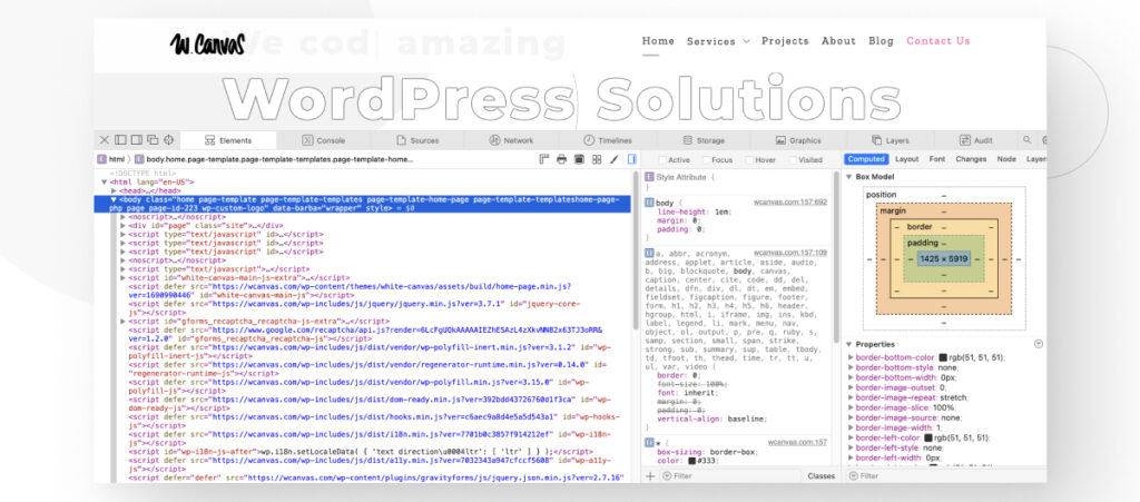
As you can see, the interface is very similar to the one that comes up when you inspect elements in Chrome. The Web Inspector includes the following features:
- Elements panel. Allows developers to view and inspect the DOM, modifying its structure and styles directly within the browser.
- Sources Panel. The built-in debugger helps locate and debug the web page’s resources, including documents, images, scripts, and stylesheets.
- Network Panel. Displays a detailed list of all network requests with information on response, status, timing, and more to evaluate performance issues.
- Timelines Panel. Provides insights into the webpage’s activity, including network requests, JavaScript events, and memory usage. All events are plotted over time for analysis.
- Storage Panel. Details the webpage’s data storage, including cookies, databases, and session storage.
- Console. Run JavaScript commands interactively and view logs, errors, and warnings to identify and fix issues swiftly.
- Graphics. Inspect HTML5 canvas, JavaScript, CSS animations, and transitions to fine-tune visual design.
- Layers. Visualizes compositing layers in 3D to analyze the rendering order and potential performance bottlenecks.
- Audit. Offers a way to check for common code and accessibility issues to ensure compliance with modern web standards.
Overall, the Web Inspector provides comprehensive web dev tools to help you test and debug your WordPress site.
#3 Mozilla Firefox
Firefox is a free and open-source web browser developed by the Mozilla Foundation and its subsidiary, Mozilla Corporation. It is known for its emphasis on privacy, security, and open web standards. It has a market share of 3%.
Firefox has various default features that protect users’ privacy and security, including a password manager, comprehensive customization options for managing cookies and site data, and tracking protection, which blocks many forms of online tracking by default.
The browser has also been at the forefront of web standards advocacy, supporting new technologies like HTML5, CSS3, and WebGL early on.
Most importantly for developers, in addition to having built-in developer tools, Firefox has an entire version of its software dedicated to developers. It’s the Firefox Developer Edition, which comes with its own distinct dark theme to reduce eye strain during long coding sessions.
Mozilla Firefox Features for WordPress Developers
Firefox Developer Edition has many tools developers can use to test and debug sites. In fact, the first thing you see when you install Developer Edition are links to the documentation, so you can start getting used to some of its features.
These are some of the main features you’ll want to check out first.
Responsive Design View
Responsive Design View is similar to Chrome’s developer tools and Safari’s Web Inspector, as it lets you see how your page would look on different screen resolutions.
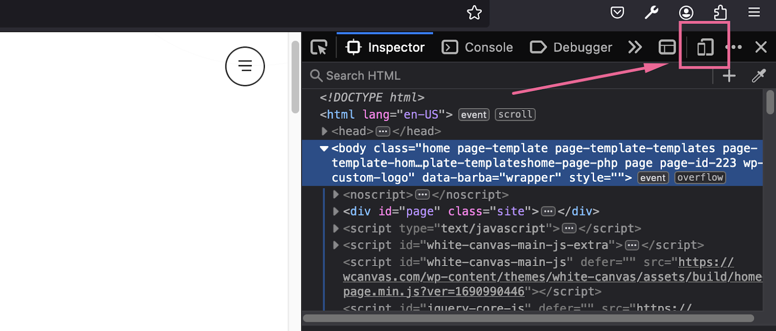
Access the feature by using the shortcut CMD + Option + I or CTRL + Shift + I to bring up the element inspector, then press on Responsive Design Mode. You can also enable the feature with the shortcut CMD + Option + M or CTRL + Shift + M.
You modify the resolution manually or drag the viewport with the control at the bottom, allowing you to experiment with various screen sizes while testing and debugging.
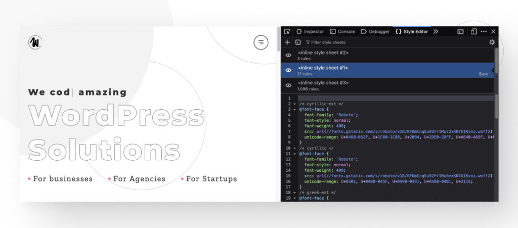
CSS Style Editor
Like other browsers, Developer Edition allows you to inspect and modify CSS styles. To enable the Style Editor, bring the element inspector with CMD + Shift + C or CTRL + Shift + C and click the icon with the two arrows to display a dropdown menu. Select Style Editor.
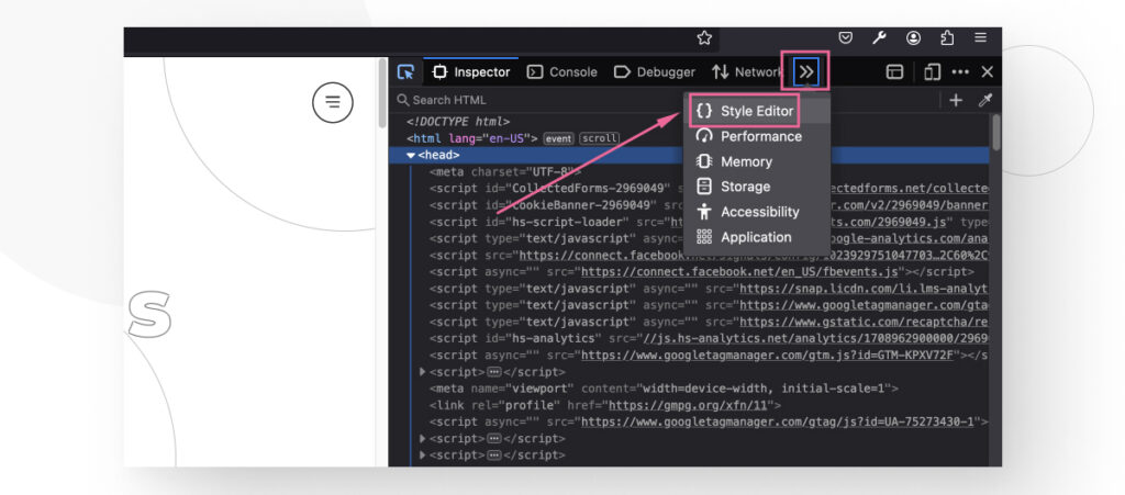
Now, you can view and modify all the stylesheets the web page is using.
Firefox Debugger
A common way to debug JavaScript code is using the console.log command to output content. Logging to the console is useful but has its limitations, so the Developer Edition comes with an integrated debugging tool you can bring up with CMD + Option + S or CTRL + Shift + S. You can also bring up the element inspector and go to the Debugger section.
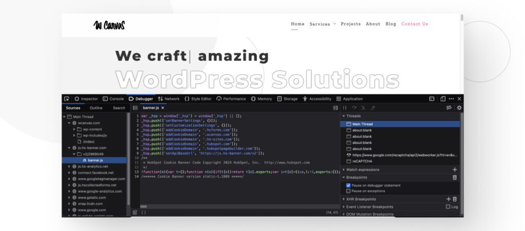
The debugger is split into three sections. The source list pane (left side) shows all the JavaScript files associated with the current page, the source pane (center) shows the content of each file in the source list, and the tool pane (right side) contains information and tools.
You can use the debugger to get variable values at specific times, run JavaScript lines one at a time, and more.
Mozilla Developer Network Web Docs
This is more of a resource than a tool, but it’s become so notable for web developers that it’s important to mention it.
The Mozilla Developer Network (MDN) Web Docs, now known simply as MDN Web Docs, is an extensive online resource for web developers maintained by Mozilla and a community of volunteers. It provides detailed documentation, tutorials, guides, and reference materials for web standards, including HTML, CSS, JavaScript, and APIs for the web in general and Mozilla-specific technologies.
The MDN Web Docs are excellent resources for beginners and advanced web developers alike.
Mozilla Firefox Extensions for WordPress Development and Quality Assurance
These are some of the most useful Firefox extensions web developers can use to make their job easier and more efficient:
- Web Developer. An extremely comprehensive and popular extension that expands upon Firefox’s built-in web dev tools.
- SEO Analysis & Website Review by WooRank. Analyzers website traffic, backlinks, usability, mobile-friendliness, and more.
- Tampermonkey. A user script manager that lets you create and use user scripts on the fly and also gives you an overview of the scripts running on your website.
#4 Microsoft Edge
Launched in 2015, Edge is the successor to Internet Explorer and the browser with the best integration with Windows operating systems. Initially built only for Windows, Edge eventually became available for macOS, Android, and iOS devices. It has a market share of around 3%.
Edge is known for having good performance and emphasizing security and privacy. It also comes with the Immersive Reader to remove distractions and help you focus on the content you’re reading, a Collections feature to gather and organize web content, optional vertical tabs, and tracking prevention measures.
Additionally, since Edge is built upon the Chromium open-source project like Chrome, it is compatible with all Chrome extensions and its own unique ones.
Edge Features for WordPress Developers
Like all browsers we’ve reviewed so far, Edge has an inspect panel you can bring up by pressing CMD + Option + I or CTRL + Shift + I.
Like other dev tools we’ve explored, it has sections like Elements, Sources, Network, Performance, CSS viewer and editor, and more to help you test and debug your site.
Edge Extensions for WordPress Development and Quality Assurance
As we mentioned, Edge is built upon the Chromium open-source project, meaning every Chrome extension listed above is 100% compatible with your Edge browser. When you access the Chrome Web Store, you will receive a message at the top of the page telling you this extension works on Edge, too.
That said, these are some of the most useful extensions you will find in Edge Add-ons, the Edge extension store:
- Cookie Manager. View and modify all cookies associated with the current page.
- React Developer Tools. Inspect and edit React components.
- Octotree. Improves the GitHub interfaces to support an IDE-like code tree.
Which Browser Should you Use to Develop Your WordPress Site?
Ultimately, many browsers provide the tools to test, debug, and optimize your WordPress site. Whether you use Safari or Firefox, you’ll find many dev tools to optimize your site.
In this sense, the browser you use for the bulk of your work depends on your preferences and other factors, like whether you have a corporate Google account that incentivizes or makes it more comfortable to use Chrome over other browsers.
That said, something that is not optional is cross-browser compatibility testing, which is testing and debugging your site on every major browser to ensure it works properly. Regardless of your preferred browser, you must always test across browsers to confirm compatibility.
But there are over a dozen browsers out there. Should you test for every browser? No, you should focus on the 4 or 5 most popular ones, which comprise more than 90% of the global browser market share. This ensures a good user experience for most users while helping you balance your workload.
How to Make Your WordPress Site Compatible Across Browsers?
Making your site compatible with multiple browsers is a subject deep enough for its own article, but we can still convey the most important points.
Most times, WordPress sites will be largely cross-compatible. This means you will generally not have any major issues with your site breaking completely in Chrome but working just fine in Edge. Most compatibility issues will be minor and typically associated with resources not rendering correctly due to browsers interpreting web standards differently.
However, you still need to address these minor issues if you want your site to be as cross-compatible as possible.
These are some of the most important steps to make your website compatible with multiple browsers.
Solution #1: Set a Doctype for HTML Files
Setting the Doctype (Document Type Declaration) at the beginning of your HTML files is essential because it tells the web browser which version of HTML the page is written in. The latest HTML version is HTML5, so it seems reasonable to think you should always set a doctype that tells the browser to use HTML5.
While that’s true in most cases, some browsers still don’t work very well with HTML5, forcing you to use HTML 4.01 instead. Which one to use changes case by case, but you should use HTML5 by default and only change to 4.01 if you notice issues.
Here’s the code for setting the doctype for HTML5. Make it the first line of your HTML files:
<!DOCTYPE html>And this snippet sets the HTML version as 4.01:
<!DOCTYPE HTML PUBLIC “-//W3C//DTD HTML 4.01//EN”
“http://www.w3.org/TR/html4/strict.dtd">
Regardless of your version, this simple line ensures that your pages render properly, solving many compatibility issues.
Solution #2: Use CSS Reset Rules
Every web browser has its own default style sheet that dictates how elements look if web developers don’t set specific styles for page elements (images, text, padding, etc.).
Examples include different border colors, padding and margin values, default zoom, and fonts. If you ever see an HTML element, such as a Submit button, that looks different in two browsers despite being on the same site, it’s likely due to differing default style sheets.
CSS resets are short style sheets that reset the styling of HTML elements to a specific baseline. That means CSS resets effectively create a standard for how elements should look on a website, regardless of the browser.
By standardizing the look of pages, CSS resets help you prevent the inconsistencies that come from every browser having different default styles.
Here’s an example of a CSS reset:
html, body, div, span, applet, object, iframe, h1, h2, h3, h4, h5, h6, p, blockquote, pre, a, abbr, acronym, address, big, cite, code, del, dfn, em, img, ins, kbd, q, s, samp, small, strike, strong, sub, sup, tt, var, b, u, i, center, dl, dt, dd, ol, ul, li, fieldset, form, label, legend, table, caption, tbody, tfoot, thead, tr, th, td, article, aside, canvas, details, embed, figure, figcaption, footer, header, hgroup, menu, nav, output, ruby, section, summary, time, mark, audio, video {
margin: 0;
padding: 0;
border: 0;
font-size: 100%;
font: inherit;
vertical-align: baseline;
}
The primary goal of this CSS reset is to remove margins, paddings, and borders from all elements. This creates a blank canvas for web developers to start styling from a consistent base across all browsers rather than creating rules for specific browsers.
There are many CSS reset scripts, but Normalize.css is one of the most popular ones, so you could start with it and go from there.
Solution #3: Use Cross-Compatible Libraries and Frameworks
Using cross-compatible libraries and frameworks significantly enhances the development process, ensures consistency across different browsers, and improves the overall quality of web apps like WordPress sites.
These libraries and frameworks provide pre-written, standardized code snippets and modules, which can save time and effort in writing boilerplate code. They often come with built-in functions to handle common tasks like AJAX requests, animations, and DOM manipulation, allowing developers to focus on the unique aspects of their projects.
They are designed to be cross-browser compatible, meaning they automatically handle many inconsistencies and bugs when trying to make your website work across browsers. This reduces the need to write browser-specific hacks or conditional code, making your job easier and more efficient.
Some of the most popular libraries and frameworks WordPress developers use include jQuery, Angular, Vue.js, React, and Bootstrap.
What’s the Best Browser for WordPress Development?
The best browser for WordPress development is the one that provides the best combination of performance, dev tools, and useful extensions. Since multiple browsers fulfill these requirements, some developers choose their browsers based on personal preferences and a few other factors.
That said, developers always test their site in the 4 or 5 most popular browsers to ensure that at least over 90% of their visitors get an optimized user experience. This way, you can do the bulk of testing and developing in your preferred browser, but you ultimately test for all the most popular ones.
Hopefully, you now have a better understanding of what each of the major browsers provides for WordPress developers and can choose the one that works best for you.
If you found this post useful, read our blog for more WordPress insights and guides!
📬 Get WordPress updates to your inbox
Sign up for WC Blog updates and never miss a post!