
WordPress Doesn’t Display Correctly on Mobile: 5 Solutions

Sometimes, your WordPress site doesn’t display correctly on mobile devices despite working just fine on desktop. This can be frustrating and hard to troubleshoot because there are so many reasons why it may happen.
In this article, we’ll explore the most common reasons why it happens and provide 5 potential solutions to the problem. Let’s get into it.
Key Takeaways
- Your mobile WordPress site may not be displaying correctly due to outdated software, cache issues, incompatible plugins, and faulty custom CSS.
- You can make your mobile WordPress site display correctly again by updating WordPress, plugins, and themes,
Why Doesn’t WordPress Display Correctly on Mobile?
There are several reasons why your WordPress site doesn’t display correctly on mobile. The most common ones are:
- Outdated WordPress, plugin, and theme versions causing compatibility issues.
- Your local or WordPress cache prevents users from receiving the newest, modified versions of your site’s resources.
- Incompatible plugins are breaking your mobile site.
- Your custom CSS has issues affecting your mobile site’s layout.
5 Solutions for WordPress not Displaying Correctly on Mobile
Let’s explore 5 solutions to help restore your mobile WordPress site to its former glory.
Important: Back up your site before moving forward with any of these solutions.
Solution #1: Update WordPress, Themes, and All Plugins
If WordPress or any of your plugins and themes need an update, this should be your first step. Sometimes, simply updating WordPress, all plugins, and your active theme may correct errors, as the problem may happen only in an older version of WordPress or any of the plugins or themes you’re using.
To update WordPress, plugins, and themes, follow these steps.
Step 1: Update WordPress
On the admin dashboard, go to Dashboard > Updates.
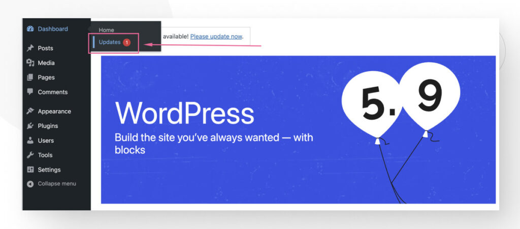
Scroll down and click the Update to version… button.
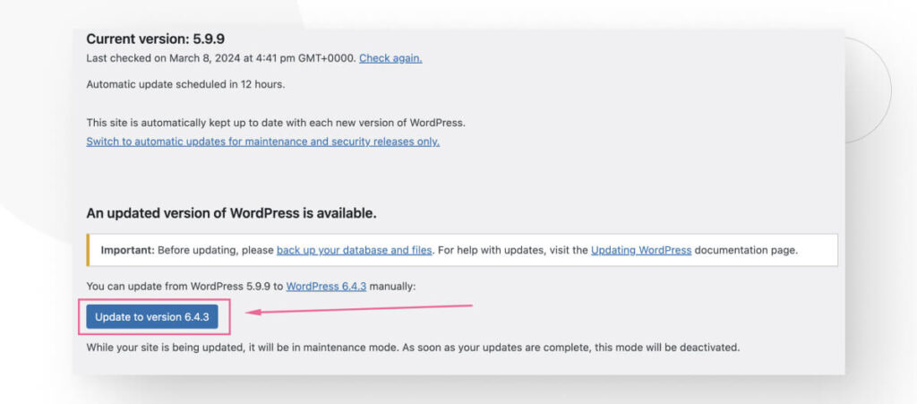
The update will take a few seconds, and then you’ll land in the About section of the version you just installed.
On the same Dashboard > Updates page, you can also update your plugins and themes. However, before updating your theme, we recommend that you take steps to preserve any custom code you’ve added to your theme files. If you haven’t added any custom code, you can simply update your theme from this page.
Otherwise, keep reading to learn how to protect your custom changes before updating your theme.
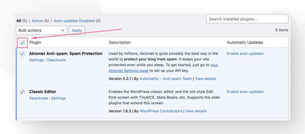
Step 2: Update Plugins
Updating plugins is just as easy. From the dashboard, go to Plugins > Installed Plugins.

Click on the empty white box to select all the plugins.
Now click on the Bulk actions menu and select Update.
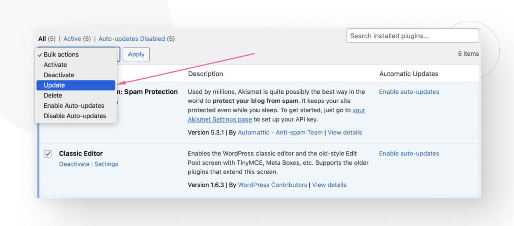
All plugins will update simultaneously.
Step 3: Update Themes While Protecting Your Custom CSS Code
If you want to protect the custom CSS code you’ve added to your theme, you should use a child theme. Here’s how to create and implement a child theme.
Create a Child Theme Folder
You’ll need to create a folder to save all the templates and assets of your child theme. To complete this, go to your hosting’s file manager and find the wp-content folder.
Once inside, look for a folder named themes. Create a new folder and name it {main-theme-name}-child. For example, if you’re using the StudioPress theme, your folder name must be StudioPress-child.
Create a Style Sheet
You must create a style sheet that contains all the CSS for your child theme. To complete this, create a new file inside the child theme folder and name it style.css.
<pre class="code-snippet"><code>
<p>Theme Name: {child theme name}</p>
<p>Theme URI: https://example.com/studio-press/</p>
<p>Version: {theme version}</p>
<p>Description: Studio Press Child Theme</p>
<p>Author: {your name}</p>
<p>Author URI: https://example.com/</p>
<p>Template: {the exact name of the parent theme folder}</p>
</code>
</pre>
You’ll need to add an obligatory header comment to make this sheet work. You must include the theme and template’s name. Everything inside the slashes and asterisks is perceived as a comment inside the code, so WordPress won’t try to execute it.
This is a default stylesheet, you will be able to add more CSS later.
Create a functions.php File and Import Styles From the Parent Theme
Create a file called functions.php inside your child theme’s folder. Inside it, paste the following code:
<pre class="code-snippet"><code>
<p>function my_theme_enqueue_styles() {</p>
<p>$parent_style = 'parent-style';</p>
<p>wp_enqueue_style( $parent_style, get_template_directory_uri() . '/style.css' );</p>
<p>wp_enqueue_style( 'child-style',</p>
<p>get_stylesheet_directory_uri() . '/style.css',</p>
<p>array( $parent_style ),</p>
<p>wp_get_theme()--->get('Version')</p>
<p>);</p>
<p>}</p><p>
</p><p>add_action( 'wp_enqueue_scripts', 'my_theme_enqueue_styles' );</p>
<p>?></p>
</code>
</pre>Now go to Appearance > Themes. If you’ve done this and the previous steps correctly, you should see your new child theme.
Activate Your Child Theme
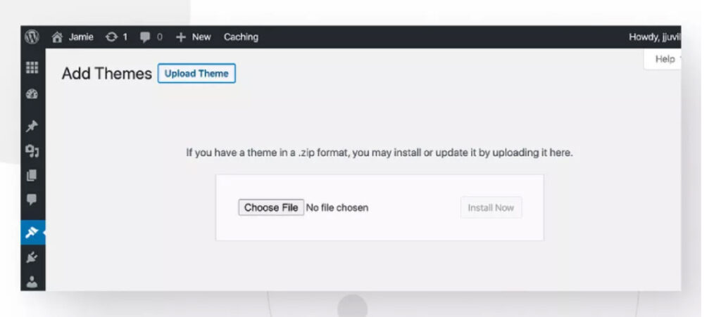
To activate the secondary theme, you’ll have to load a zip file of the child theme folder.
To achieve this, go to your WordPress admin panel and click on Appearance > Themes > Upload theme. Then, select your child’s theme location.
Customize Your Child Theme
As you’ll see, your uploaded theme looks exactly like your parent theme. That’s because you haven’t made any changes to it yet. Now is the moment to customize it, adding code to your CSS stylesheet and functions.php file.
Update Your Theme
After saving all your custom CSS changes on a child theme, go back to Dashboard > Updates to update your theme.
Solution #2: Clear Your Site’s Cache
If your mobile WordPress site doesn’t display correctly after you made recent changes, it’s possible that your page caching solution is preventing these changes from appearing on your live site.
Caches can improve site performance by storing copies of resources and quickly serving them to users without the extra load of generating them from scratch upon every request. Still, they can cause trouble if the cached copy of a resource prevents users from accessing the updated resource.
To prevent this, clear the cache on your local mobile browser and your caching plugin.
Clear the Cache on Your Mobile Device
Let’s start with your mobile device:
- On your device, open Chrome. Tap More (the 3 dots on the upper right-hand corner) and then Clear browsing data.
- Tap More options. Select “Cookies and other site data” and “Cached images and files” and tap Clear data.
The steps vary depending on your browser, but they’re very similar across the board.
After clearing the cache, refresh your site and see if it displays correctly.
Remember that if clearing the local cache fixes the issue, you still need to clear the cache on your WordPress site so all your users can access fresh copies of all resources.
Clear the Cache on Your WordPress Site
One of the most popular methods for building and maintaining WordPress caches is using a caching plugin. One of the most popular caching plugins is WP Super Cache.
To clear the cache using this plugin, go to Settings > WP Super Cache.
Scroll down and click on the Delete Cache button.
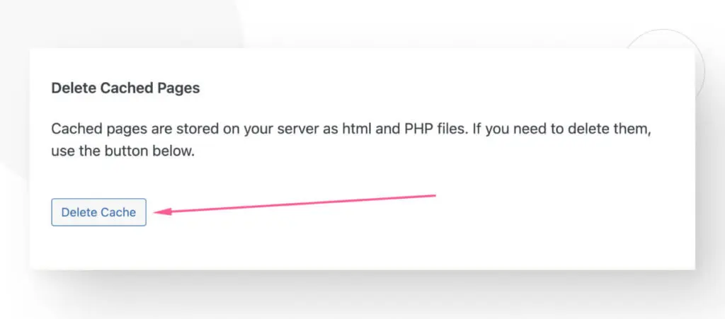
You’ll land on a new screen. Click on Delete Cache again.
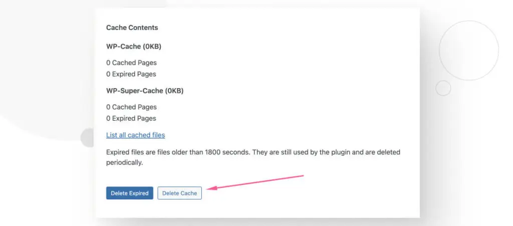
This will delete the site’s entire cache and force the server to provide users with fresh copies of all resources. Hopefully, this will fix the issue.
Keep in mind that other caching plugins have slightly different steps, but they’re essentially the same process.
Solution #3: Explore Plugin Incompatibilities
Some themes don’t work well with specific plugins or some of the plugin’s settings. This can cause the mobile version of your site to break and display incorrectly.
For example, some older Jetpack settings aimed at optimizing mobile performance used to cause trouble for certain themes like Kaira around 2018-2019.
Spotting these incompatibilities can be hard because you never know which plugin may be causing the issue, so the best way to confirm the culprit is to deactivate all plugins and reactivate them individually.
Here’s the step-by-step guide.
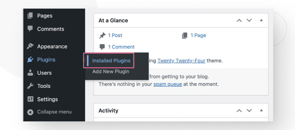
From the admin dashboard, go to Plugins > Installed Plugins.
Click on the empty white box at the top to select all plugins.
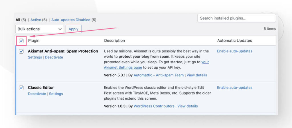
Now go to the Bulk actions menu and select Deactivate.
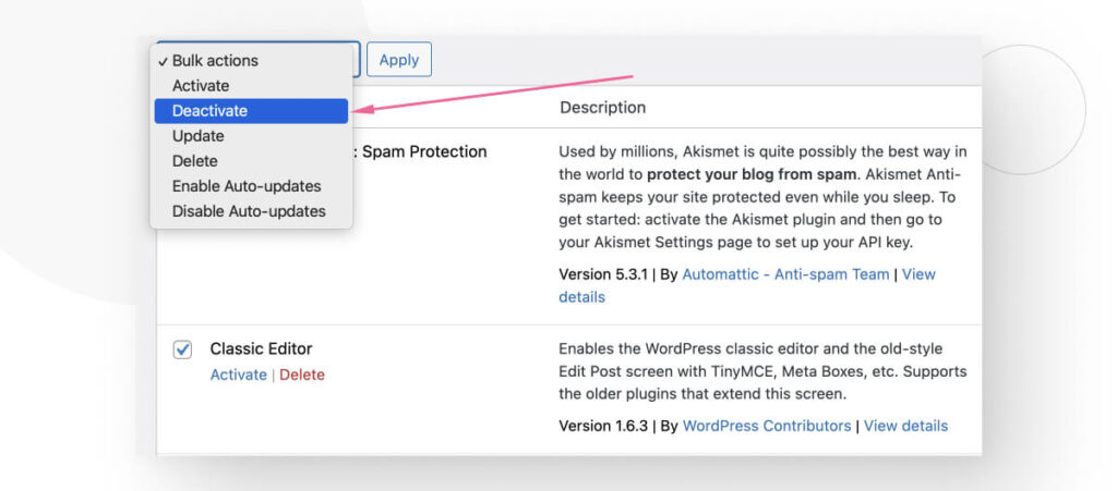
At this point, all plugins will be deactivated.
To test compatibility, start activating each plugin one by one. After activating a plugin, return to your mobile site and see if it displays correctly.
If one of the plugins is the cause of the issue, at some point, you’ll activate a plugin that will break your mobile site.
Once identified, you may explore the plugin’s settings to see if you can configure it to solve the issue, contact the plugin developer to ask about it or switch to a similar plugin that doesn’t break your mobile site.
Solution #4: Design Your Site With A Page Builder Plugin
Many site owners prefer using page builders like Elementor and Beaver Builder, as these plugins handle most of the web design and mobile responsiveness for you.
The disadvantage is that they are more limited in the designs you can implement compared to coding your sites, but many owners without coding skills find this to be a fair trade-off.
Let’s use Elementor, one of the most popular builders, as an example. To install it, go to Plugins > Add New Plugin from the dashboard and search for “Elementor.”
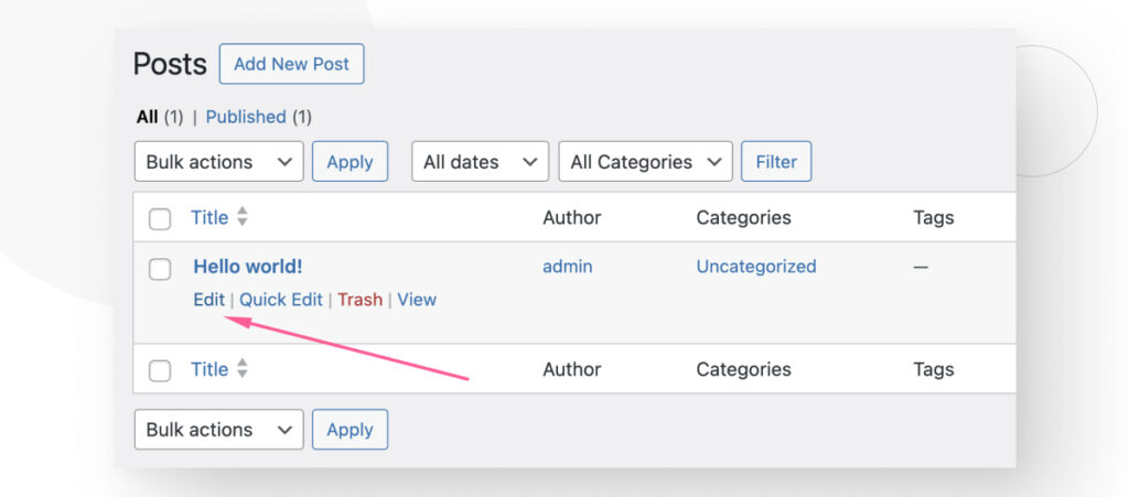
After installing and activating it, return to the dashboard and create and edit pages or blog posts. For example, go to Posts > All Posts and click Edit on any post.
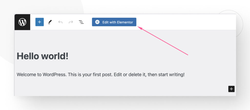
Now click on the Edit with Elementor button at the top.
You will see all of Elementor’s page-editing options on the left-hand sidebar.
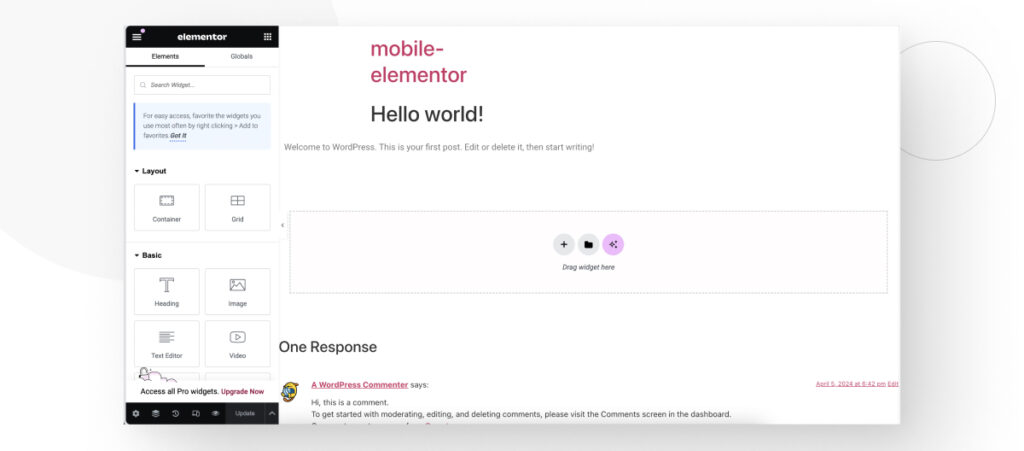
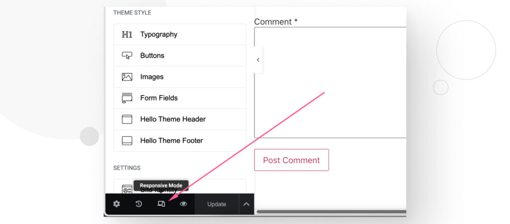
To edit your pages specifically while seeing how they’ll look on mobile, click the Responsive Mode button at the bottom of the sidebar.
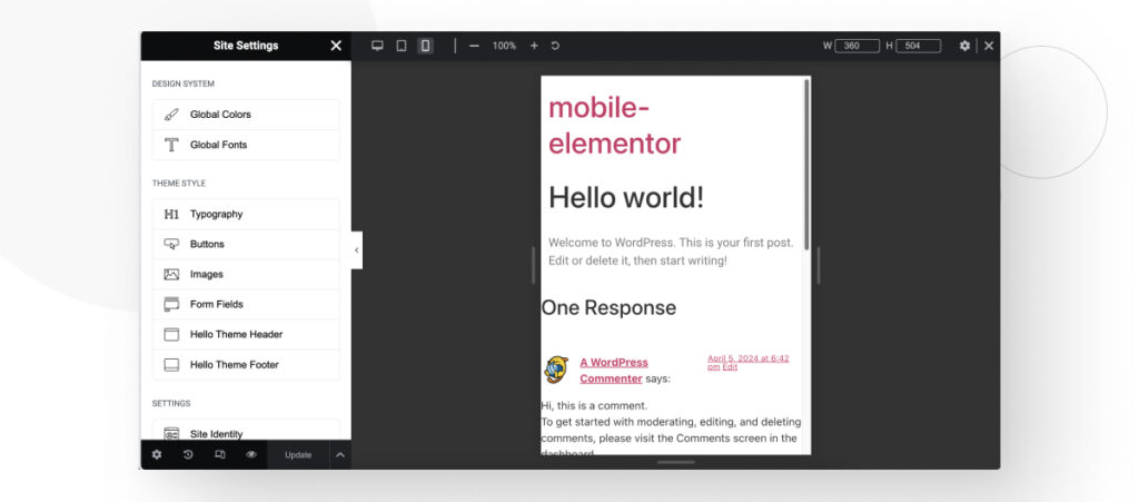
A new set of features will appear at the top of the page. Click on Mobile Portrait.
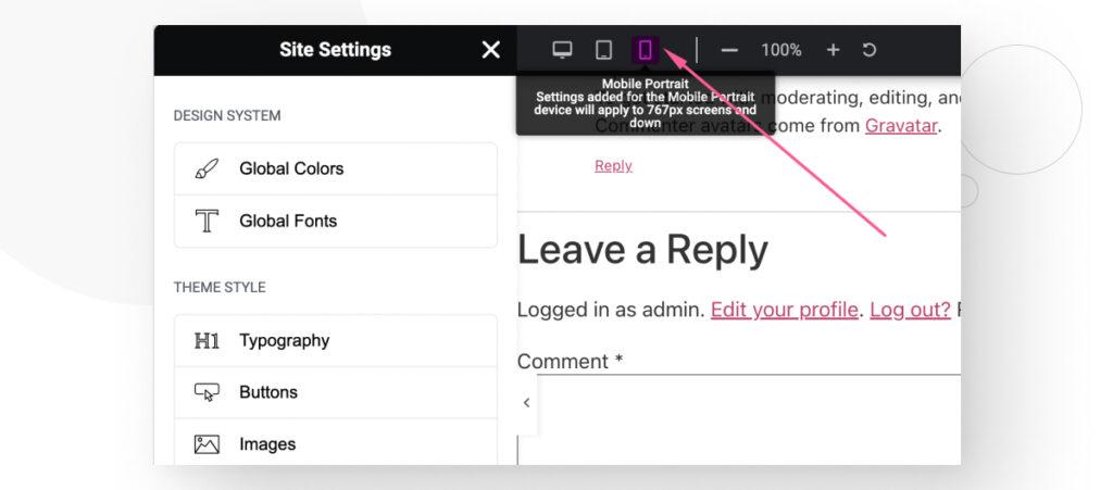
Now, you can edit your site while previewing how it’ll look on mobile, letting you spot issues on the fly.
Solution #5: Check Your Custom CSS
Lastly, if you recently made changes to your custom CSS (remember to use child themes), some of them may be causing your mobile site to break.
While CSS troubleshooting is a topic that requires its own article, here are a few recommendations:
- If you’re still learning to use CSS, read WordPress’s CSS tips and resources guide for beginners.
- Use W3C’s CSS validation tool to check whether your style sheet has a syntax error.
- Use live CSS editing extensions like Stylus for Firefox or Visual CSS Editor for Chrome. It’s safer and quicker than editing your style sheets. If you fix the issue, you can simply paste the changes to your actual style sheets.
For a full breakdown of various CSS troubleshooting techniques straight from the WordPress team, read the CSS Troubleshooting guide.
General Recommendations for High-Performing Mobile WordPress Sites
Based on our experience, here are some of the best strategies to boost your mobile site’s speed:
- Keep WordPress, all plugins and themes, and PHP updated.
- Use only optimized and responsive themes.
- Use a fast WordPress web hosting service.
- Use a caching plugin.
- Prevent hotlinking.
- Optimize images with a plugin.
- Reduce each page’s weight by minifying user-facing code and implementing text compression.
- Use a lazy loading plugin. Sometimes, image optimization plugins come with lazy loading features.
- Use a content delivery network (CDN).
- Display only excerpts of your pages and archives. To display excerpts instead of the full content, go to Settings > Reading from your admin dashboard. Find the “For each article in a feed, show:” option and tick “Summary” instead of “Full Text.”
- Break your comment sections into pages. Go to Settings > Discussion, find the “Break comments into pages” option and tick the checkbox next to it.
Combined, these changes will help you build a fast mobile site.
Make Your Mobile WordPress Site Display Correctly Again
With the 5 solutions provided in this article, you should be able to make your mobile WordPress site display correctly again. While these solutions are not the only ones possible, they address the most common reasons your mobile site may be down.
If you found this post useful, read our blog for more WordPress insights and guides!
📬 Get WordPress updates to your inbox
Sign up for WC Blog updates and never miss a post!